
Hey there! Rachel has a stunning new collection out this weekend with rich textures and lovely September colors. When I was making my page this week, I felt like adding a digital photo on top of this amazing mixed media kit she created just wasn’t good enough, and I wanted to add some texture to the photo by making it look crumpled and old. Here’s my layout this week.

Here’s Rachel’s new releases for this weekend’s Build Your Own Collab at the Lilypad. To create my layout I used some of each of these four new releases.


I learned this technique a long time ago, so I hope I can explain this in a way that is helpful. Digital scrapbooking has come a long way since I learned this and there are now overlays you can buy to create the same effect, but I often find they don’t fit quite right and sometimes I like a little more control over what I want the effect to be.
Just a note, this technique tends to work best with photos or solid papers, the crease gets lost in patterns or light colors. For this tutorial, I’m using a solid paper from the Signature Kit 6 so it’s easy to see, but I applied the same technique to make it look like my photo had been folded and creased for my layout.
Start with your paper on the bottom layer and add a blank layer above.

Make sure your Rulers are showing and create guides where you want your paper creases to go. Also, make sure you have Snap to Guides selected.

Create the guides by dragging your cursor from the ruler to where you want the paper to be folded.
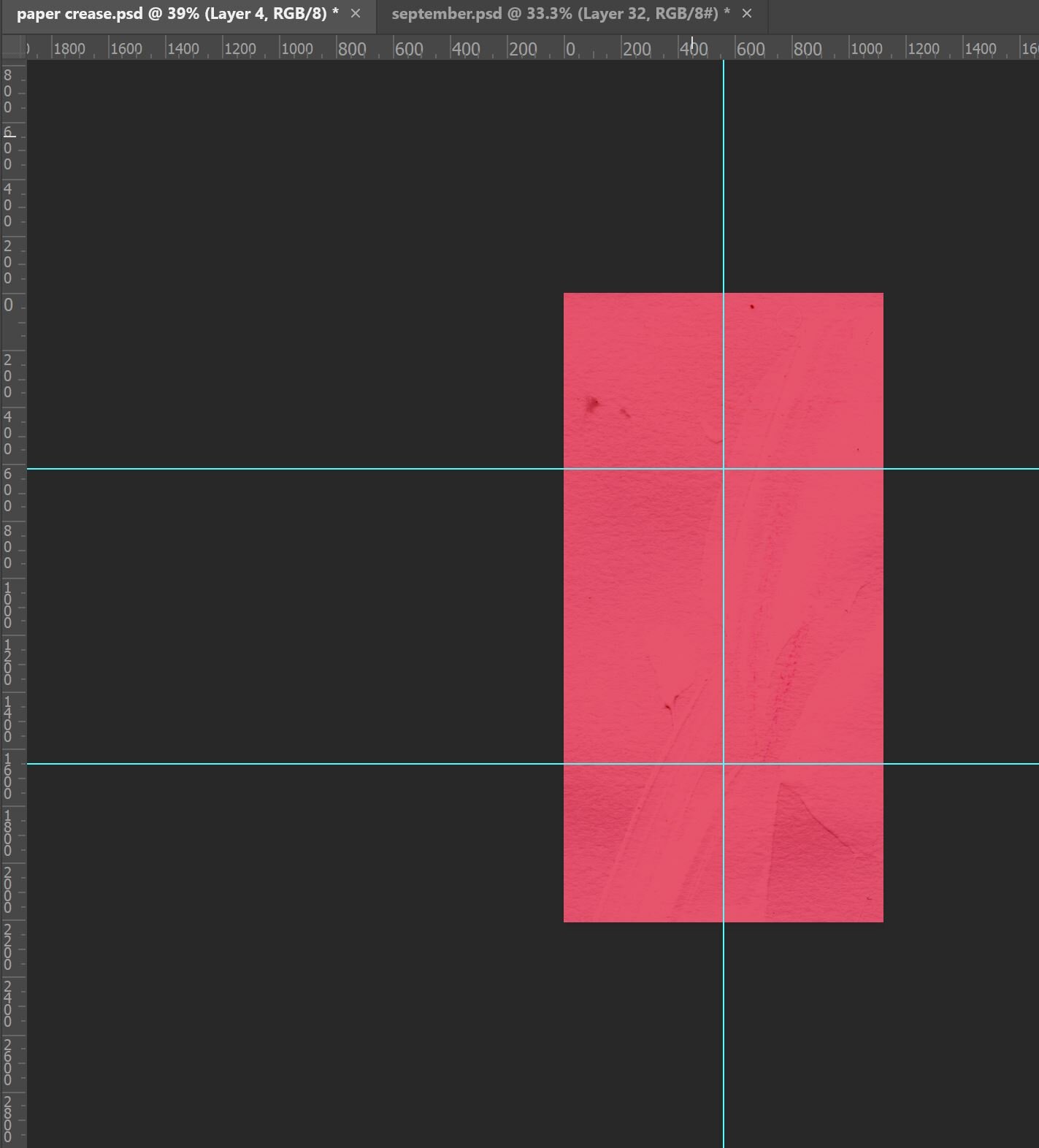
In our next step we are going to create gradients in each of the rectangles we have created with the guides on our second layer. The purpose is to create shadowing to make the paper look like it was folded along the guides. Using the Rectangular Marquee tool, select the top left rectangle created with the guides by dragging from the edge of the workspace to the guides.

Choose the gradient tool with the following settings, using the basic black and white gradient.

Making sure you are still in your blank layer 2, drag your gradient tool in the direction you want your shadow. You are going to want the shadows to vary across each of the rectangles you’ve created. Once you make the first gradient, deselect and repeat this process for each of the rectangles.

The following image shows each of the rectangles gradient directions.

Now set this layer to Soft Light in the Layer panel.

Your paper should now look similar to this.

Our next step is to create the crease in the folded areas. We will do this by using a chalk brush (look for it in the Legacy Brushes) set to an approximate size of 159 with the following settings. For the color of the brush, I chose a soft light to medium gray.

You’ll want to change the brush settings to the following: reduce the roundness to 35%, and set the spacing to around 95%.
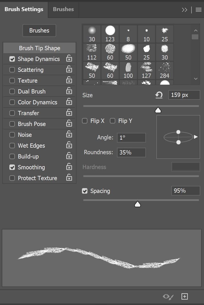
We will also want to change some of the shape dynamics, move the Size Jitter all the way to 100% and most importantly, change the Control to Direction. This allows the brush to flow in the direction you are using it, which is important when we make the vertical and horizontal lines.

Create another new blank layer on top.

Place your brush at the top of the paper over the vertical guide (make sure you haven’t turned off that “snap to guides” setting). Drag your brush down along the guide. It will be hard to see what the brush is doing with the guide there, but keeping the guide there will keep your line relatively straight. Do the same with the horizontal lines on the same layer.

When you turn your guides off (go up to View>Show and uncheck Guides), you will see the brush stroke. Set this layer to Soft Light as well, so that the brush stroke blends in a little better.

There you go, you have a folded paper or photo!! I hope you can give it a try some day when you want to add a little texture or distress effect. You can always play with the directions of the gradient overlays and the amount of folds to change things up. Here’s a close up of the finished photo in my layout with the folded crease. Thanks for following along, and don’t forget Rachel’s new releases are on sale through the weekend release!
