
Hello again, everyone!
Deborrah here again with a tutorial on using BIG stitched elements in a layout.
Rachel Jefferies created this wonderful series of Stash Builder collections that were designed to help you build a stash of items for pocket pages. But, of course, as soon as scrappers began working with them, they used them in ways I’m sure she hadn’t imagined.
Such is the case with her Pocket Art Signature Kit 4 and Stash Builder Kit No. 2 which you might have in your stash or you may have recently purchased during a recent SOSN Sale at the LilyPad.
I fell in love with the big, stitched flowers and leaves she created for the Stash Builder kit and wanted to use them for a layout, but not a pocket page.
So, let’s begin putting them to use. I started with this paper from the Pocket Art Kit No. 4.

I wasn’t sure if I liked the green paint down the left side – I had envisioned a more central vertical page design, so I enlarged the paper so that the left side wasn’t visible.

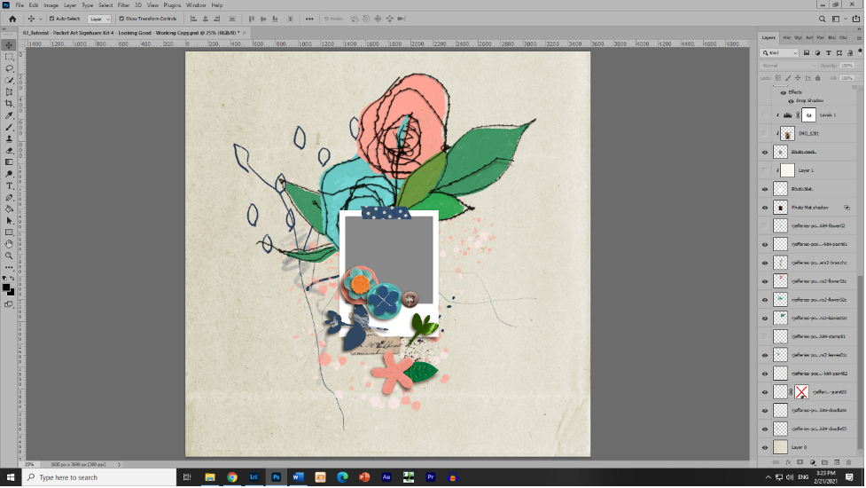
Next, I brought in my stitched flowers and leaves since this is what I really wanted to work with. I’m often amazed how one or two elements can direct the design of a whole layout!
My idea was to create a vertical design down the middle of the page, so I played with them until I was happy with how they all blended together

Next I brought in the frame for my photo. I wanted to get the general structure down before I began playing with other things. I decided to use the Polaroid frame included in the pocket page template that Rachel made for the kit. I absolutely LOVE scavenging items from templates!! They are often a treasure trove of perfectly put together clusters, paint and frames that can be lifted from the template and put into a layout! In this case, I used the frame from this template:

Next, I brought in some paints, flowers and other elements to continue my vertical design idea.

After some playing around, I settled on using the doodles up top to fill out the stitched flowers, placing the paints behind them. I loved the paint splotches, but they were a little bland against the paper I chose. So, I played around with some blending modes.
OH! What are blending modes? If you have never used blending modes, you are missing out!!! They can totally change the look of an element or paper. Here’s how to find them.
In your layers panel, click the little down arrow next to Normal. A drop down menu will appear showing you all the available blending modes you can use. Play with them and don’t panic! If your element seems to disappear, change it back to normal. The blending modes change the colors depending on dark and light. In this instance, I wanted the pink paint to pop more against the background paper. I chose “linear burn” so that the paint will have a darker look, thus:
See? The paint has a deeper, richer look to it.

Now with the white paint, I wanted it also to pop more against the background, but because it’s white, I used Screen mode. That made the white paint whiter and voila! It looks great!

Now to the rest of the elements! I played around with my flowers, doodles and doodads and came up with this arrangement. It stayed with my vertical design, but gave it some movement and flow, as well.

It’s coming together beautifully! Now, for my photo. It’s so interesting; sometimes, I start with a photo and search for a kit that fits the photo. More often, lately, I am beginning with a kit and letting the word art in the kit direct me to a photo. That is the case for this layout. I knew I wanted to use the word art “great things take time to grow” from this kit, and it led me this photo of my son who just began his first job as a fire fighter/paramedic.
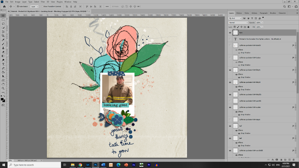
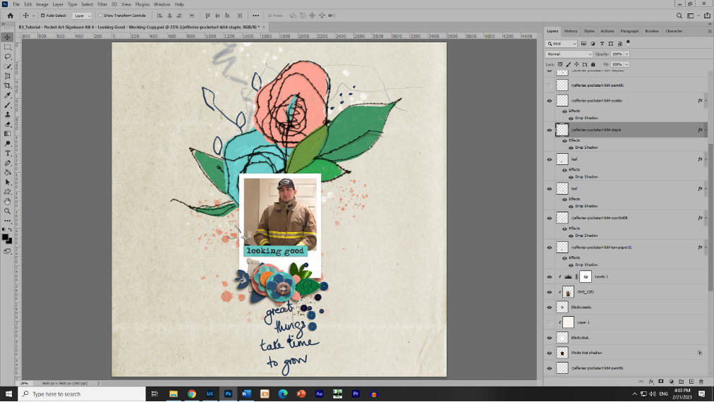
I also loved that little word bit “looking good,” and put it at the bottom of the photo. Perfect! But … hmmm, I don’t like the blue polka dot tape with the turquoise word bit. I could change the color of either, but in the end decide to replace the tape with a staple.
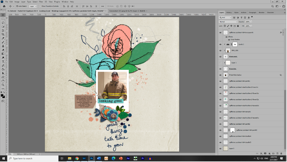
Now for journaling! I want to write about the pride I feel for my son and document the date of his first fire fighter/paramedic job. But where to put it and keep my vertical design. I discover the answer in the diagonal line created by the stitched leaves. They start at the top right and move diagonally down to the left, and then the flower cluster picks up the line and leads the eye toward the bottom middle. What if I put my journaling at one of those points?

I like it!
The last little thing I do is to change the color of the frame mat. It’s a little too white for me, so using the dropper, I pick up the white from the paint and create a layer of that color and clip it to my frame. There are other ways to do this, but this way I can change mind later.

And, speaking of changing my mind – remember when I didn’t like the green side of the paper? I’m thinking now that it might look nice. I even add a little brown paint to pick up the color of my son’s jacket.

And there it is!! I hope I’ve inspired you to take another look at some kits in the store, or in your stash. I love using things in different ways. Happy scrapping!