Have you ever started a layout and looked at the finished product and just felt like something was wrong, it just wasn't working? Well I'm here to tell you that it happens to everyone, and when it does, take a step back and look for a few subtle changes that can make a big impact. In this case, it meant keeping the elements I had, but making a slight change to the coloring so that everything flowed together well.
I had been wanting to scrap this photo for a while. It's one of my favorite photos from last year. It was such a moody photo, my daughter was pouting in her adolescence on the beach, disappointed that during vacation the riptides were too strong to venture out into the surf. I had tried using this photo a couple of times, and in Rachel’s Tall & Wide template as well, and nothing seemed to be working.

I went back to the original photo and realized one of the things I loved most about the photo was the red sweatshirt. Once I did that I remembered the inspiration that was used in the Rachel Jefferies Mixed Media Challenge at The Lilypad. May's challenge was Inspired by Textiles, and one of the photos included in the mood board had bold red, black and white markings. Everything just clicked at that moment and I knew I needed to start the layout over.
Focusing in on the red, black and white area of the textiles mood board, I began looking for elements from Rachel's kits that would work well with the photo and the inspiration.

Once I download a kit, I also keep a copy of the element and paper previews in a folder with that designer's name, the following previews had the colors I wanted to use in the layout, so I focused in on those kits,


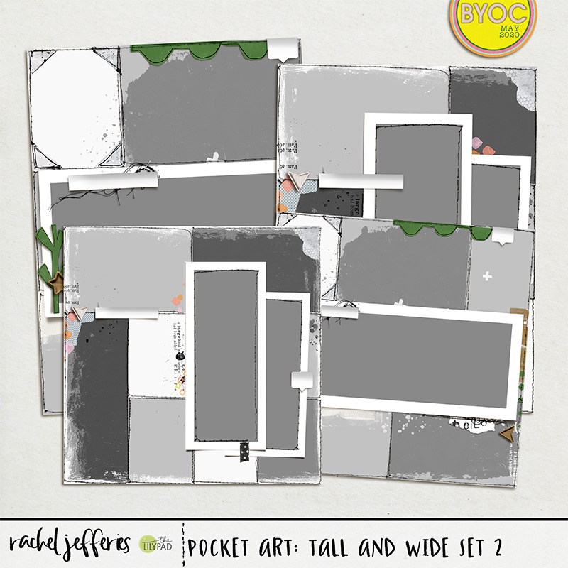
From here I went back to the template and the layout I had started with and pulled over my favorite parts. I had used Rachel's Pocket Art: Tall and Wide Set 2 template on the first draft of this layout and wanted to keep the pocket card stitching.
I also kept a couple elements from the Welcome Every Moment Collab kit I had used on an earlier attempt to scrap this photo.

I was a messy paper scrapbooker and I take the same kind of chaotic mess to my digital pages as well, I'll pull everything onto the page and keep moving everything around until it fits where I want it, and often redo the background multiple times. On this page I was pretty much finished but I was missing some of the red pop I needed and also the background was too stark white.

I focused in on the markings from the inspiration piece and decided to recolor some of the marking I took from Rachel's kits. There are several ways to do this, but on paint and markings the easiest way is adding a color overlay layer effect.
In Photoshop in your layer panel, choose the fx Color Overlay option.


Simply choose the color you want the paint or marking to be. There are other options for blending or opacity, but since I wanted these to look like they were made by makers, keeping it a solid color worked best.

That layer effect can be edited from the layer panel at any time:

I recolored the Xs, and both the arrow elements. The recoloring not only helped pull the red through the page but added a vertical movement to the elements as well.
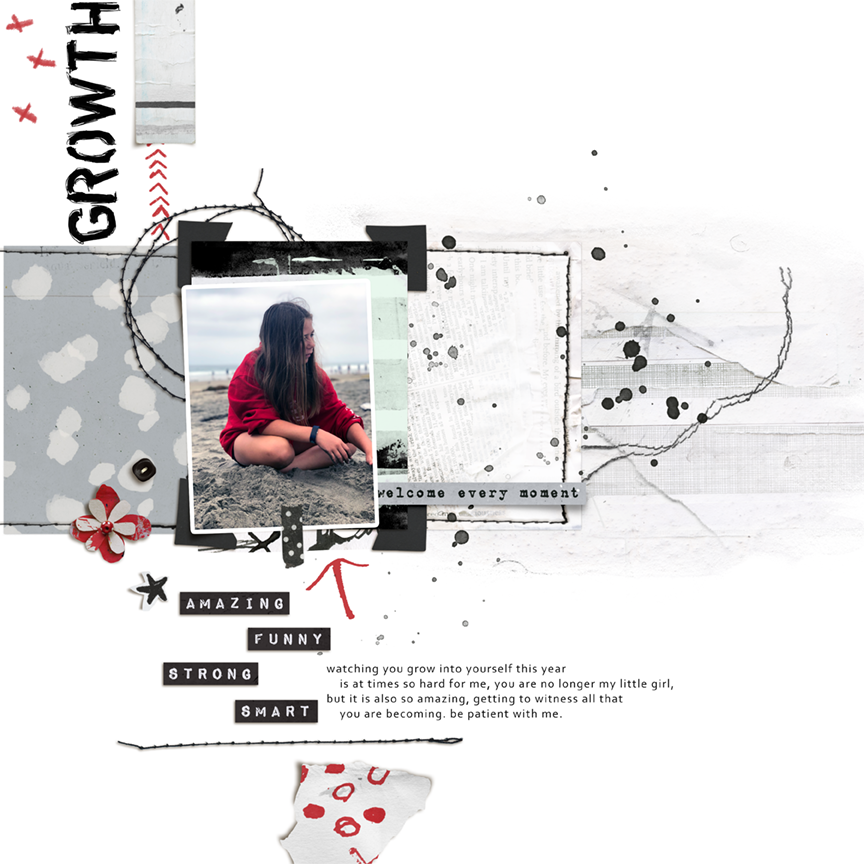
In keeping with the theme of the Textile challenge I knew I needed more texture in the background. I added a paper from the Pocket Art kit but it just wasn't working quite right for me. I loved the texture but felt like it was too dark and overpowering the elements. I decided to keep the paper but to lighten it a bit. Again, there are many ways to do this, but for this page I simply lowered the opacity on the paper layer using the tools in the Layer Panel, making sure that the paper was the layer just above a pure white background.

I moved the opacity down until I felt like the paint/mixed media layer blended nicely with the paper, but I could still see the texture. Just that subtle change brighted the page and helped the elements pop, here you can see the background on the Left with the lowered opacity vs the Right with the background straight "out of the box"

I hope these simple and subtle tips can help you take a layout you just aren't sure about, to one you are ready to print and display!