Hi everyone!
I’m so excited to be here and share my first tutorial for Rachel Jefferies!
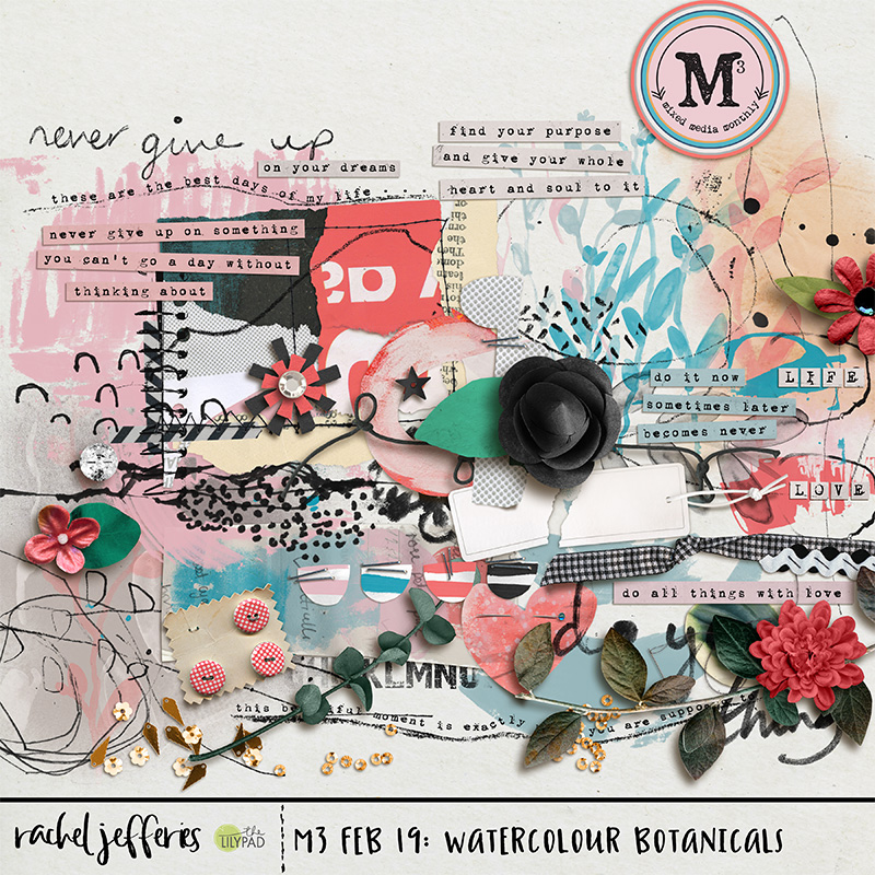
It’s no secret that I love Rachel’s style. She has this wonderful knack for creating digital mixed media elements and papers. And I LOVE that artsy style! All those splotches, stitches and art marks placed around the page. But, when faced with a blank sheet of paper, I don’t know what to do – I’m not an artist. Where do I start?
Fortunately, Rachel Jefferies is here to help me. Her artsy, mixed media papers are the perfect way to start a layout. They have movement, flow and an embedded design for us to discover and follow. And she’s genius at creating elements that work perfectly with the papers.
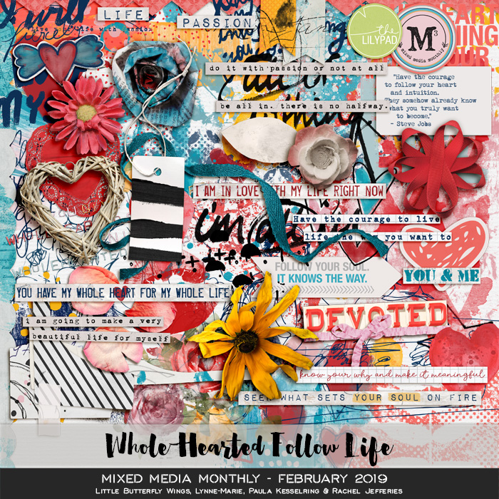
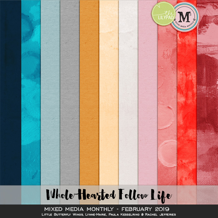
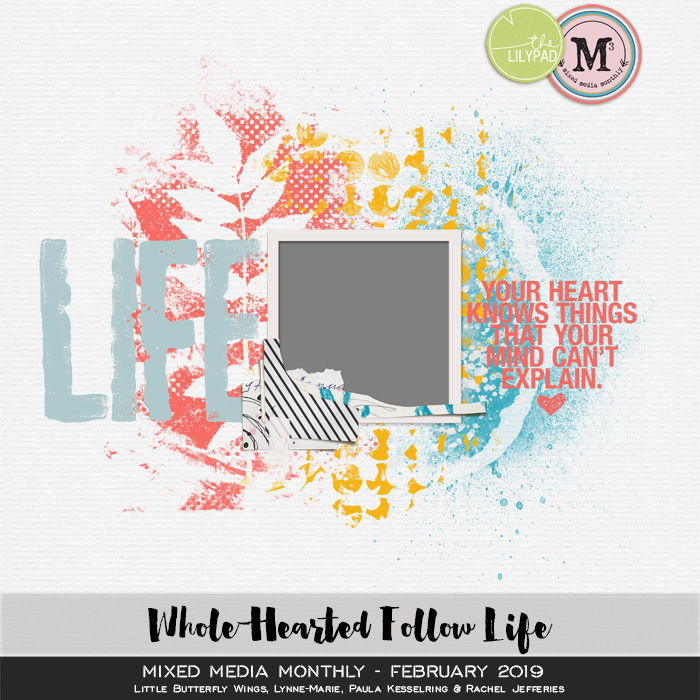
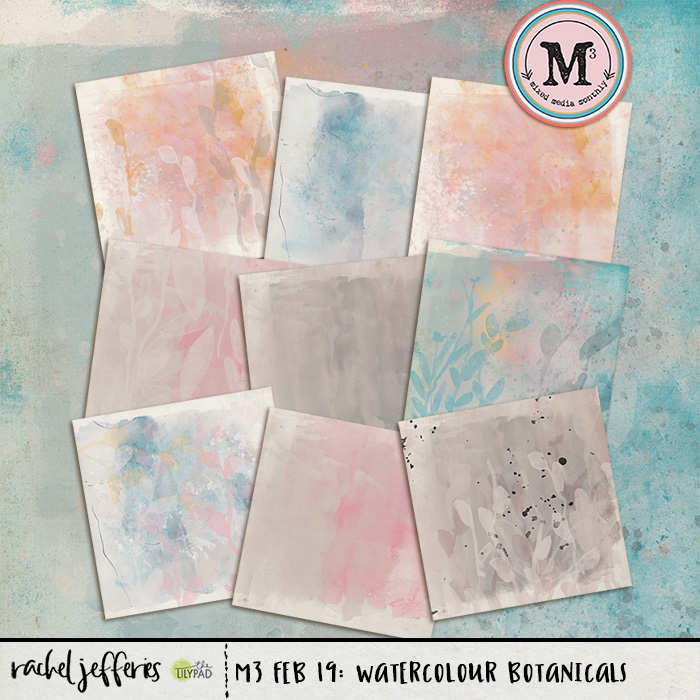
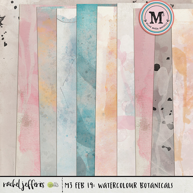
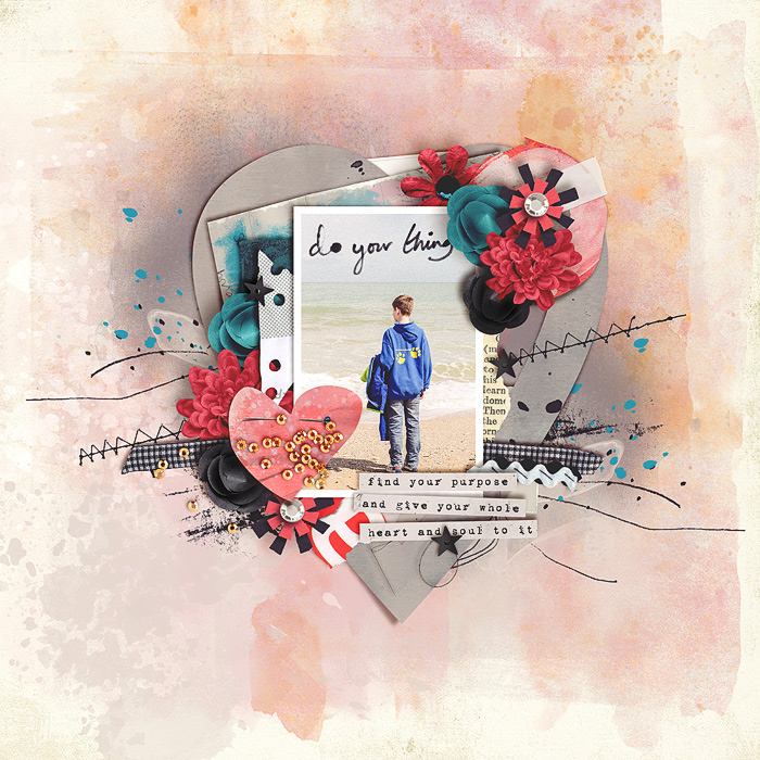
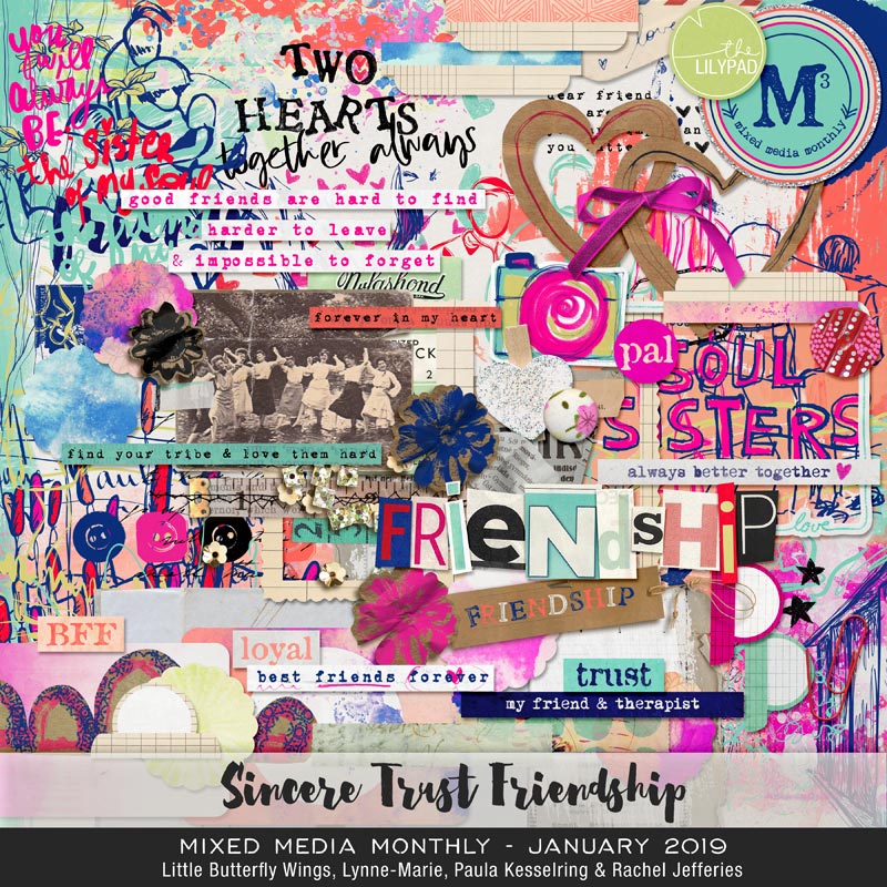
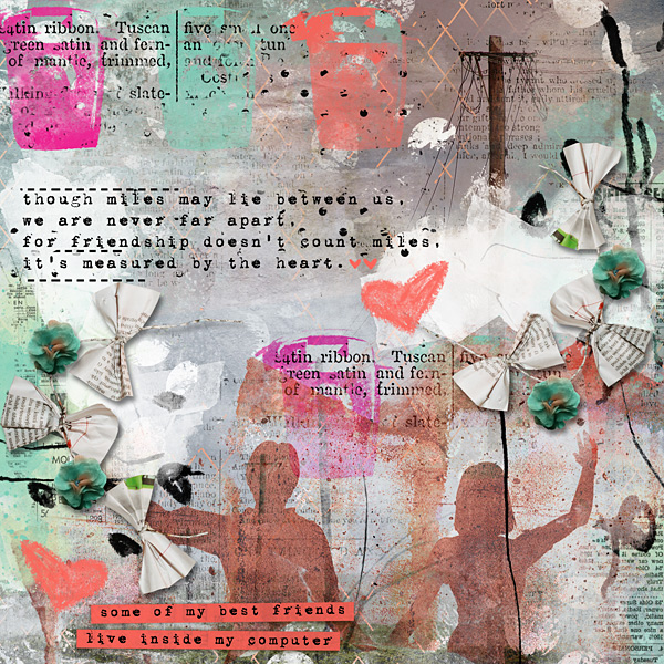
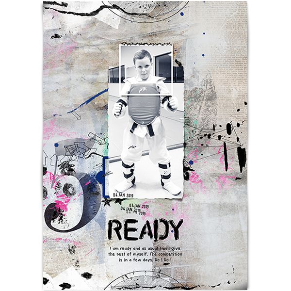
For today’s tutorial, I’m going to be working with the February, 2020, Mixed Media Monthly Collaboration – I am Enough and Rachel Jefferies add on to that collection, Flaws and All, Mixed Media Artistry. Let’s start with this awesome paper by Rachel from the M3 Collaboration.

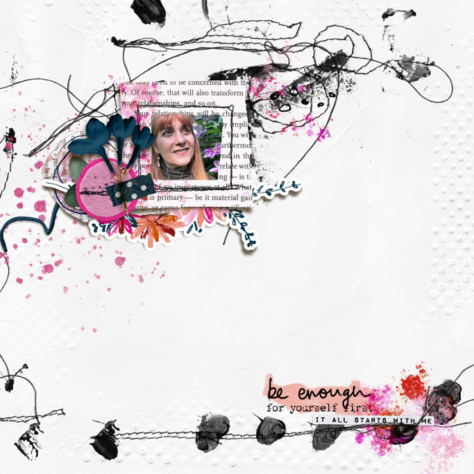
I love all those stitches and art marks everywhere. If you examine the paper, you will see that it’s already predesigned with places to place a photo. While everyone looks at things differently, I always look for places on artsy papers where lines come together. Others may have different criteria, but to my eye, those are natural spots for photos.
Here, I see three possibilities which I have marked with Xs.I am going to choose the Red X for my focal point.

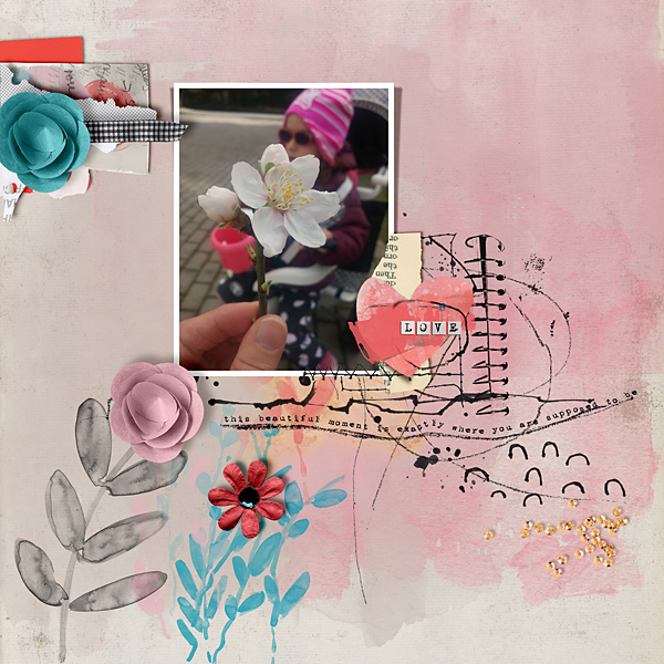
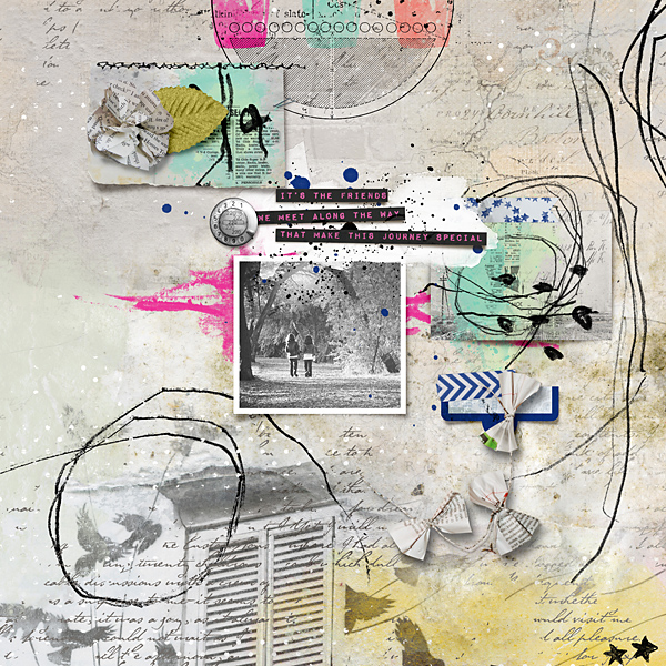
Flaws and All has a lovely paper frame that I’m going to use to start creating a cluster of papers. A cluster of papers and layers around a photo creates a natural resting point for your eye. I’m going to choose papers pieces, flowers and doodles to start my cluster.
The stitches and marks seem to be flowing from top right to bottom left so I’m going to anchor the frame on the bottom left corner. Many of Rachel’s paper pieces and elements come both pre-shadowed and plain. I like more realistic shadows and she does a beautiful job with shadowing, so I’m going to use the shadowed versions.
Play around with the order of the layers! There is no right or wrong way to place them – it’s totally up to your eye. I eventually decided on this layering order. You can see the order in the layers panel to the right of the paper. (Green)

I can’t imagine a layout without flowers and some kind of leaves, so I’ve chosen a shadowed flower with tape, a leaf and a pink felt flower. I want the blue flower on top. The leaf and felt flower do not come with a shadow, so I’m going to have to add my own shadow.
Shadowing is a lot of fun to do and not difficult at all. To create a simple shadow, double click on the layer of the element. The following box will appear. Click on the box that says “Drop Shadow.” (If Drop Shadow is not listed, click on the fx in the bottom left corner and choose Drop Shadow.)

Once you have this box open, you can create your shadow. Here is a quick overview of each of the things you need to consider to create a simple shadow:
1. Blend Mode: Choose Linear burn for heavy, thick shadow. Choose Multiply for one that is lighter.
2. Opacity: This is the darkness of the shadow. The higher the number, the darker the shadow will look.
3. Angle: This is the direction from which the light is coming. Usually I choose 120, 66 or 45 for my angles.
4. Distance: This will determine how far away you want the element to appear to be off the page. Remember “Pop dots?” Choose a lower number for labels, papers, or things that are close to the background; choose a higher number for thick elements that have a lot of depth.
5. Size: This is how much of a shadow you want – the bigger the number, the more dispersed the shadow will be (i.e., how far away the light source is).
Play around with your shadows! The more you practice the better you’ll become.

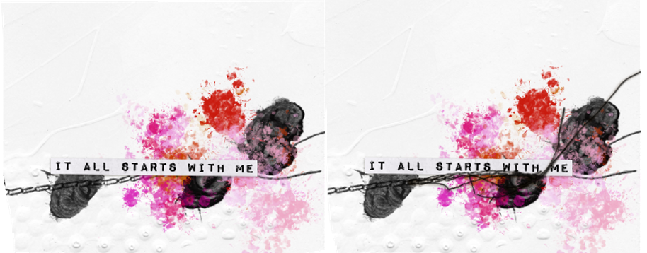
I’m liking this! But, it feels like I want a little more flow to the flower cluster. I’ll add a string and place it under all of the layers.
Now I want to anchor my design by creating a triangle. Triangles create natural resting points for the eyes in design. The background paper is black and white, but I’ve used paper pieces and other elements with pink in them. The M3 collection and the add-on both have pink paints, so I’m going to use them to create a triangle. My goal is to lead the eye from pink paint to pink paint and back again.

Nice! I’m planning on putting my title in the bottom right corner, and I want it to have depth. I’ve chosen a word strip from the collection. I love how it looks, but if I were doing this with paper, I would have stitched it down when I stitched the background. Since the paper already has stitching, I’m going to take a stitch from the kit and place it over the word art so that it looks like it’s part of the background stitching.
Now for the photo! I chose a photo of my sister that fits the theme of this layout. But, the photo has an orange cast to it that doesn’t work with all the pink. To fix this, I’m going to add a cool color filter over the photo.
On the bottom right corner of your layers panel in Photoshop you’ll see a little half moon icon – this is your adjustment layers panel. You can add adjustment to photos or elements without changing the original element, just in case you change your mind about what you’ve done.


Once I choose the Photo Filter option, it will create a filter above the layer. You can see that layer highlighted above. But – WHOA! Look what it did to my layout! It placed a color filter over everything below that layer!
No worries – by clipping the filter to the photo itself, it will only add the filter to the photo. Just right click on the filter layer and choose “Create Clipping Mask.” You’ll see a little arrow pointing down to the layer below.

MUCH BETTER!
Now, I’ll add my title to the bottom corner and I’m done!
Rachel’s mixed media papers are simply fabulous to help you get started with a layout. I hope you can see them now through a new lens and that you are inspired to try this yourself
The kit I used for this tutorial, Flaws and All: Mixed Media Artistry, is on sale today, Wednesday, 2/10, 50% off!!!
Our Creative Team is always available at The LilyPad to answer questions – to reach me, just message DivaMom96 or you can post a comment to this tutorial on the blog which Rachel will administer!
Happy Scrapping!