Scrapbook Layouts

Creating Depth, Shape and Texture with Digital Scrapbooking Stamps and Ephemera

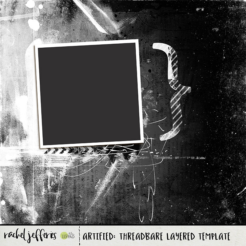
So what is a smart way of using digital scrapbooking stamps and paint to give a page a Mixed Media Twist and what is it that makes a good ephemera cluster?

These are questions that I've been asked and I thought you might find my insight helpful.

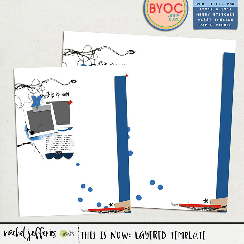
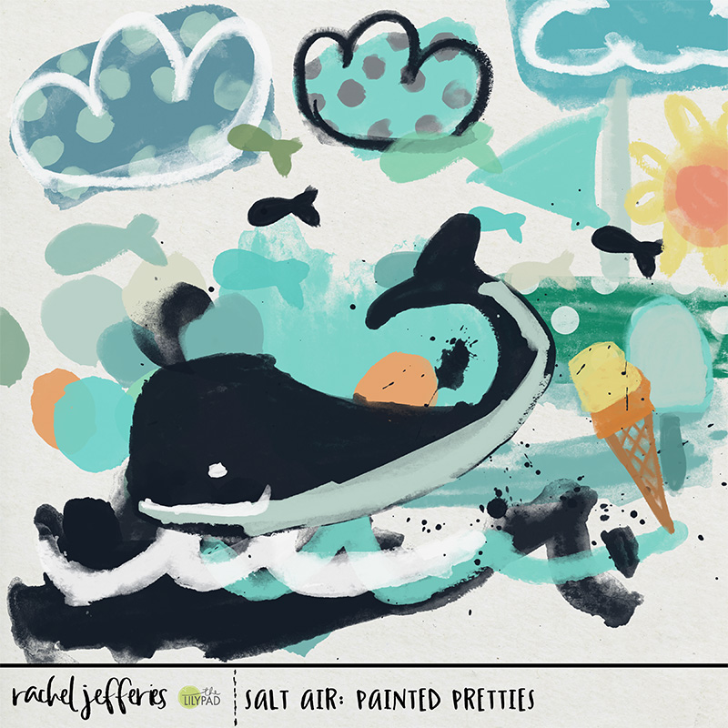
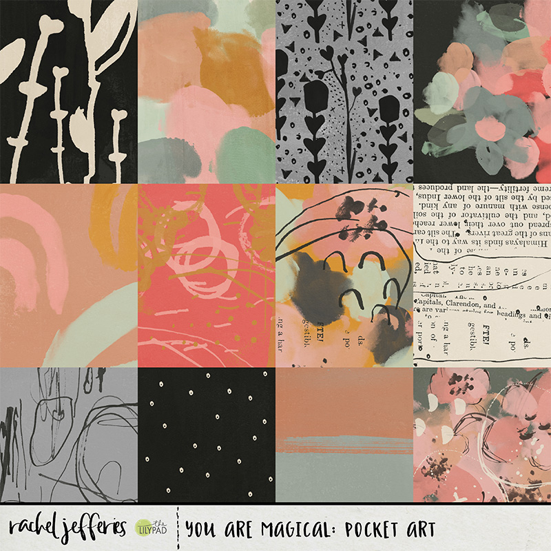
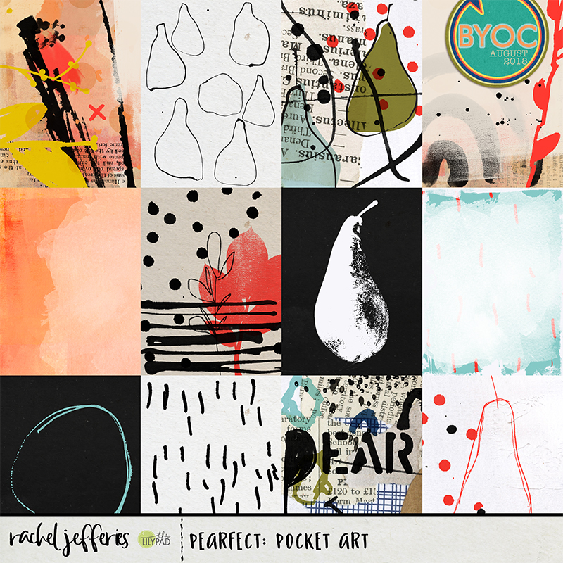
Take a peek at the up and coming August Build Your Own Collection at the LilyPad. It's called Wonderful You and it celebrates us exactly as we are, quirks and all and is a fab all rounder and everyday kinda collection.

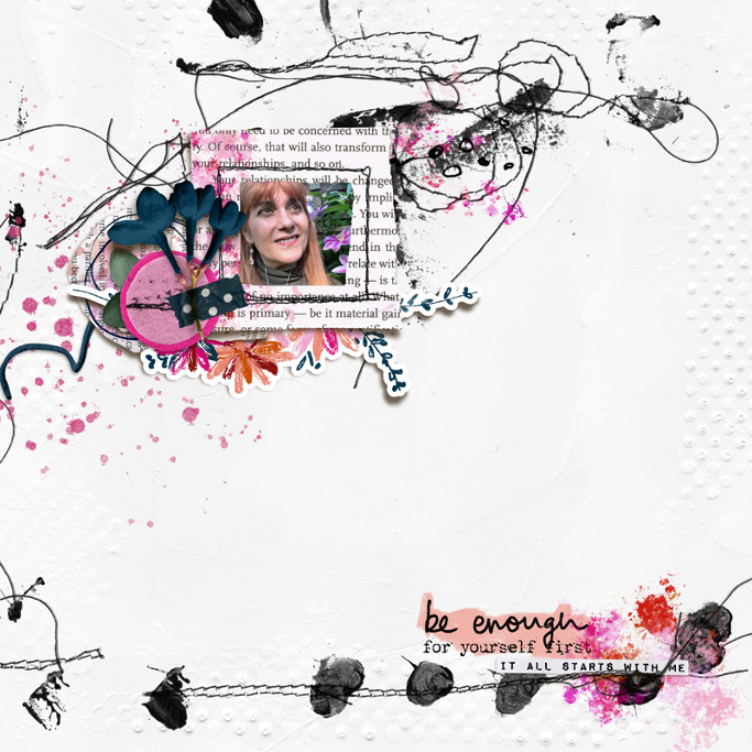
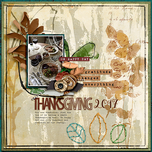
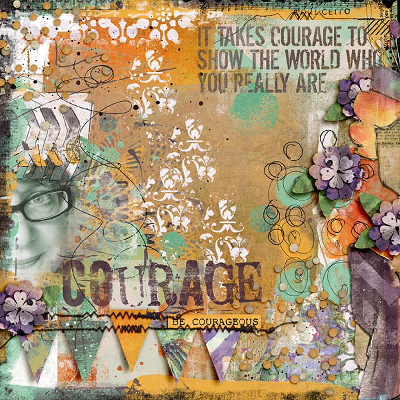
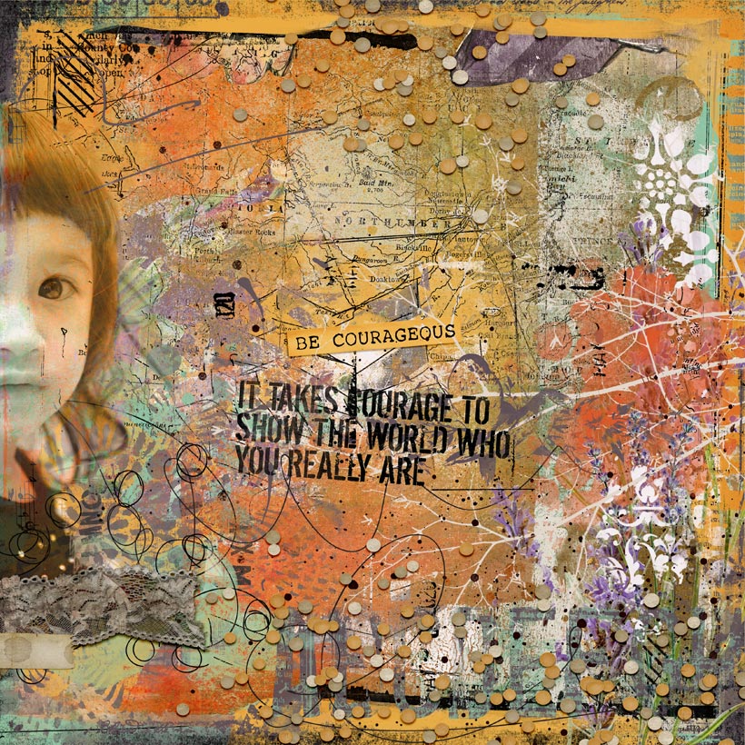
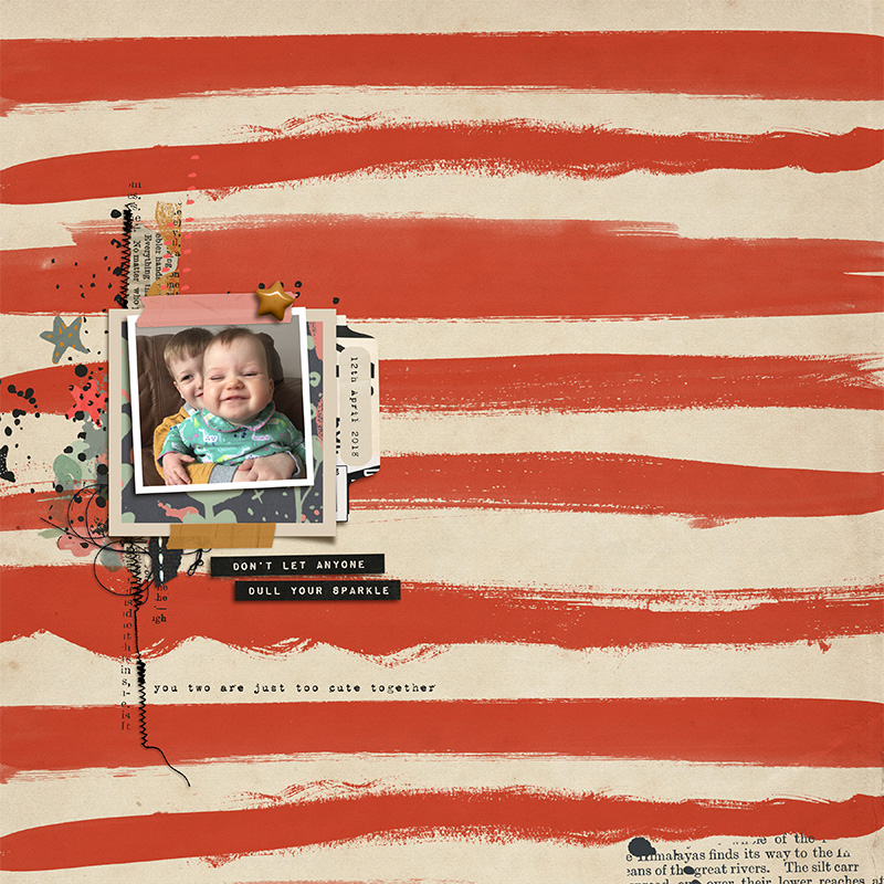
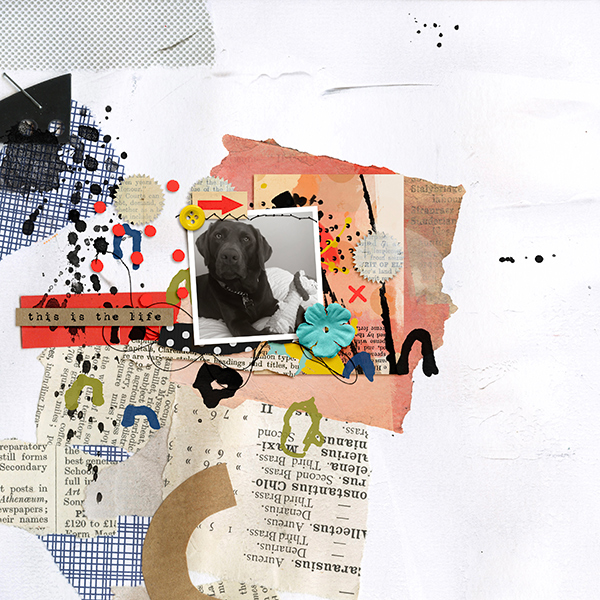
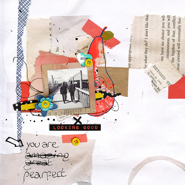
I used Wonderful You to create a page that would help me walk you through these tips and I hope you find them helpful.

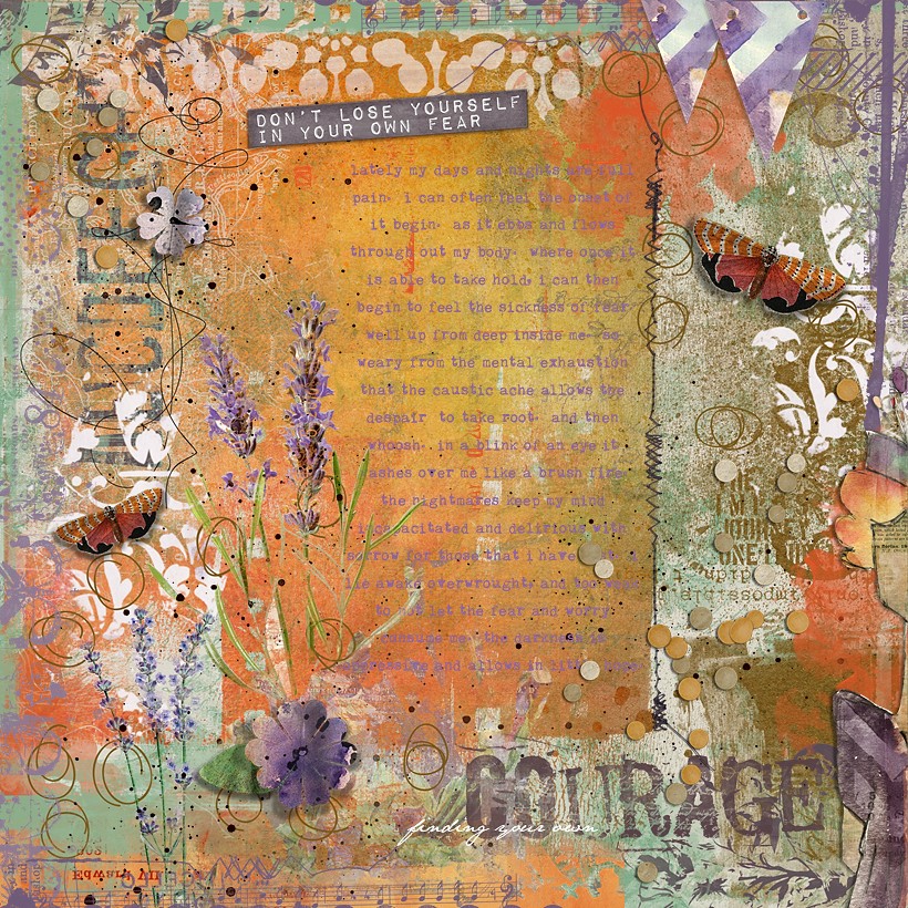
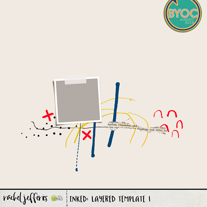
Stamps and paint can help the eye to wander and to create flow, they assist in creating shape and extending extend lines, and they can also fill empty space plus add beautiful texture.

When choosing digital stamps for your pages look for variety. Select different stamps to add texture and interest and those that will draw out areas of your composition that already exist.

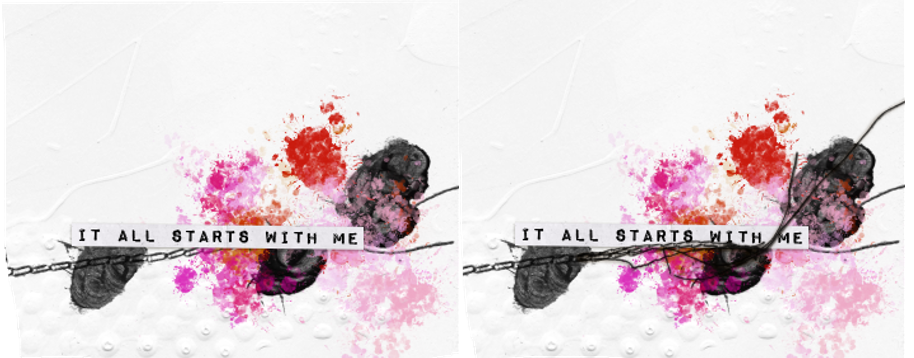
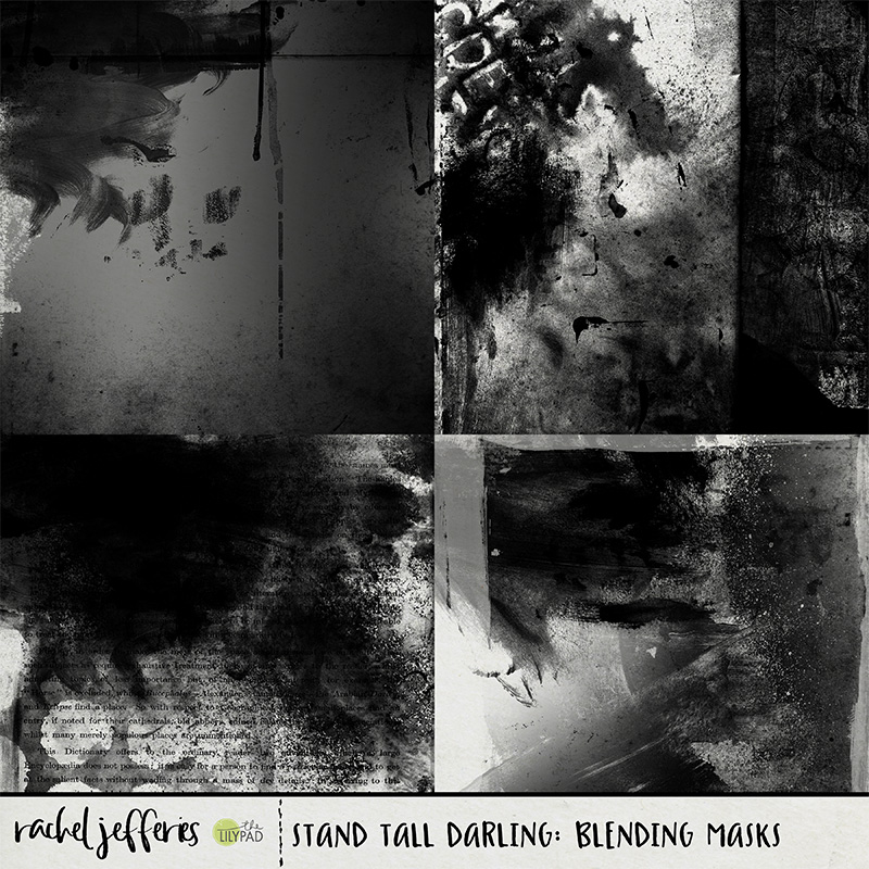
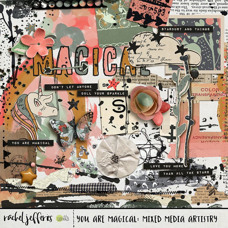
For variety look out for text fragments, splatters, defined pattern stamps like stars or dots, scribbles and abstract marks that include lines.

Study your page and look for areas that can be 'drawn out' by adding some stamps. We can exaggerate lines or areas by making them longer or wider by adding marks and stamps

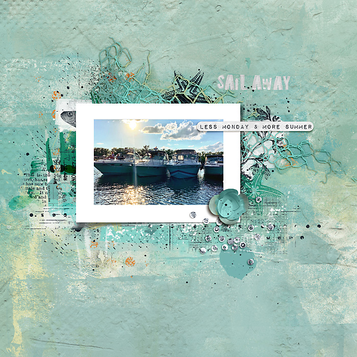
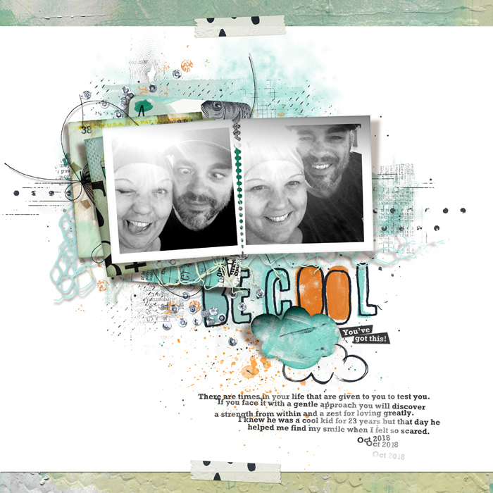
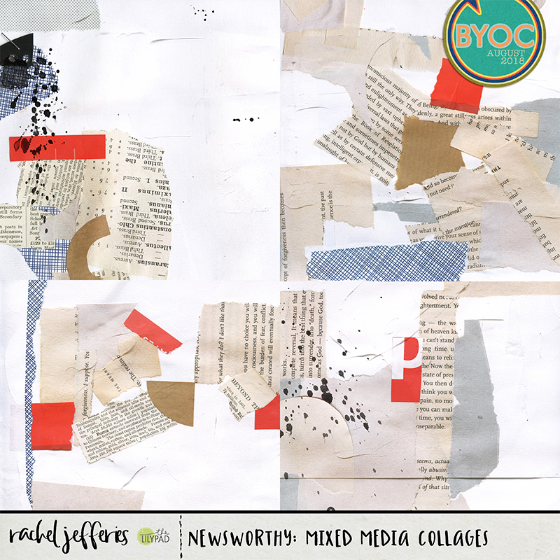
A good ephemera cluster doesn't detract from your photograph or main focal point and is great for adding contrast and depth. It can also help to create shape and movement when paper bits are stacked and are lying at different angles with each other.

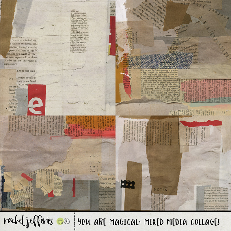
Consider your colours and ensure they compliment or just add some needed contrast to your photograph or the main focal point to your page. Neutral or monochrome colours are a good starting point. Again, consider using a variety of different types of ephemera to add texture and interest.

For variety within your ephemera type elements look for tickets or papers that contain text, and then also items that have pattern or print. Personally I love to add pops of black and white for contrast but it depends on your page what will suit, it's just a matter of experimenting

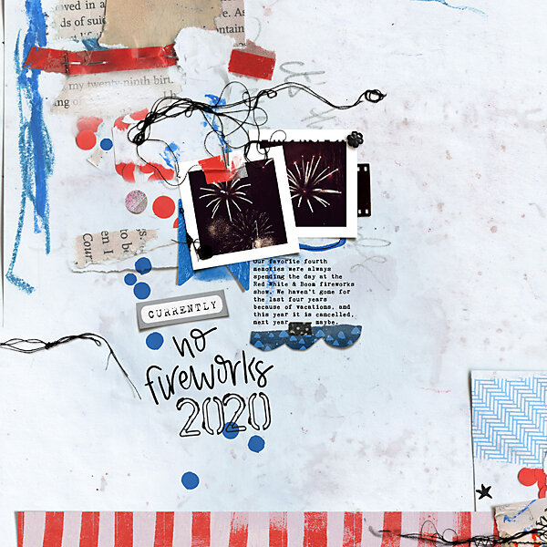
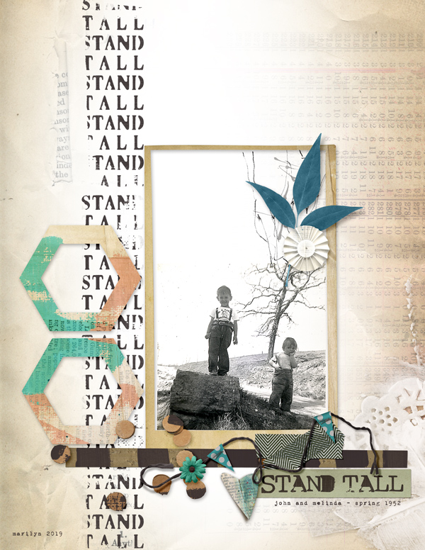
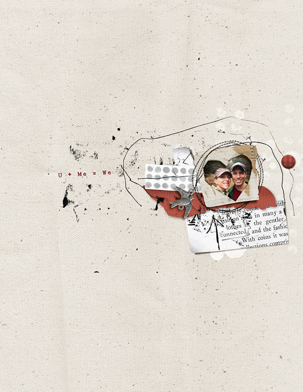
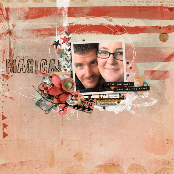
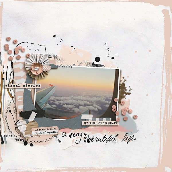
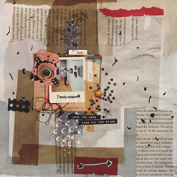
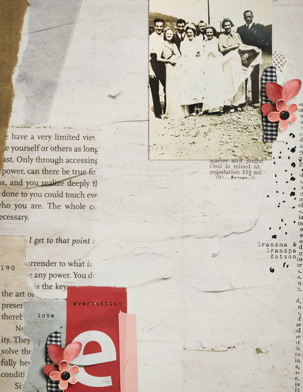
In my page I have used the paper scraps/ephemera to add a little extra height behind my photo and to create depth by layering at least three or four paper items. I also took the liberty of a few extra little things peeking between my clusters and a piece of fabric poking out of the side to add a different texture to the paper stacks.

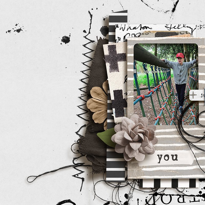
Don't forget about 'dressing your cluster up', I like to add trailing threads, bits of stitching and scattered sequins or beads so that things are not so rigid or uniform.

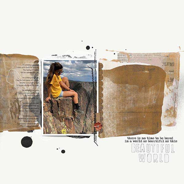
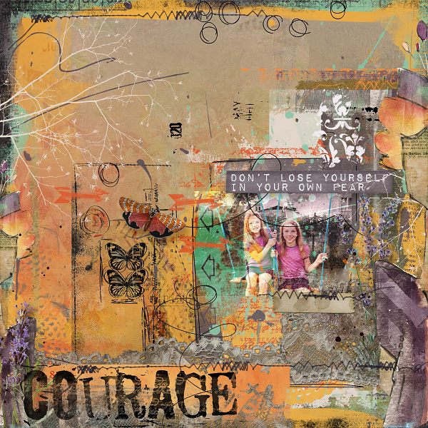
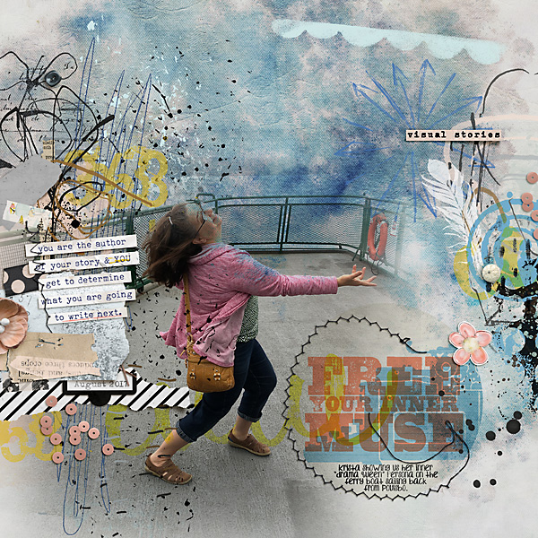
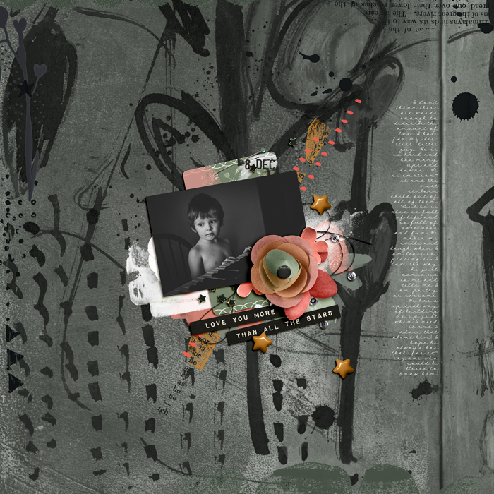
Here is a short video showing my layout without my paper stacks and stamps and what a difference they make and how they can create shape. I make reference to our July Mixed Media Challenge at the LilyPad where we will be practising these techniques this month, you can find that here and I'd love it if you can join us!

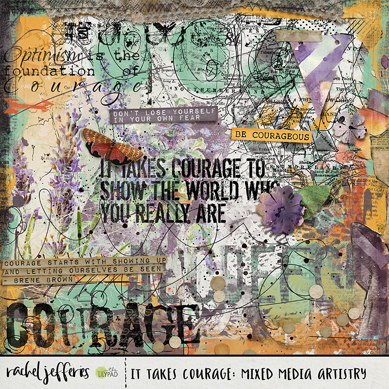
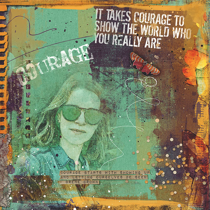
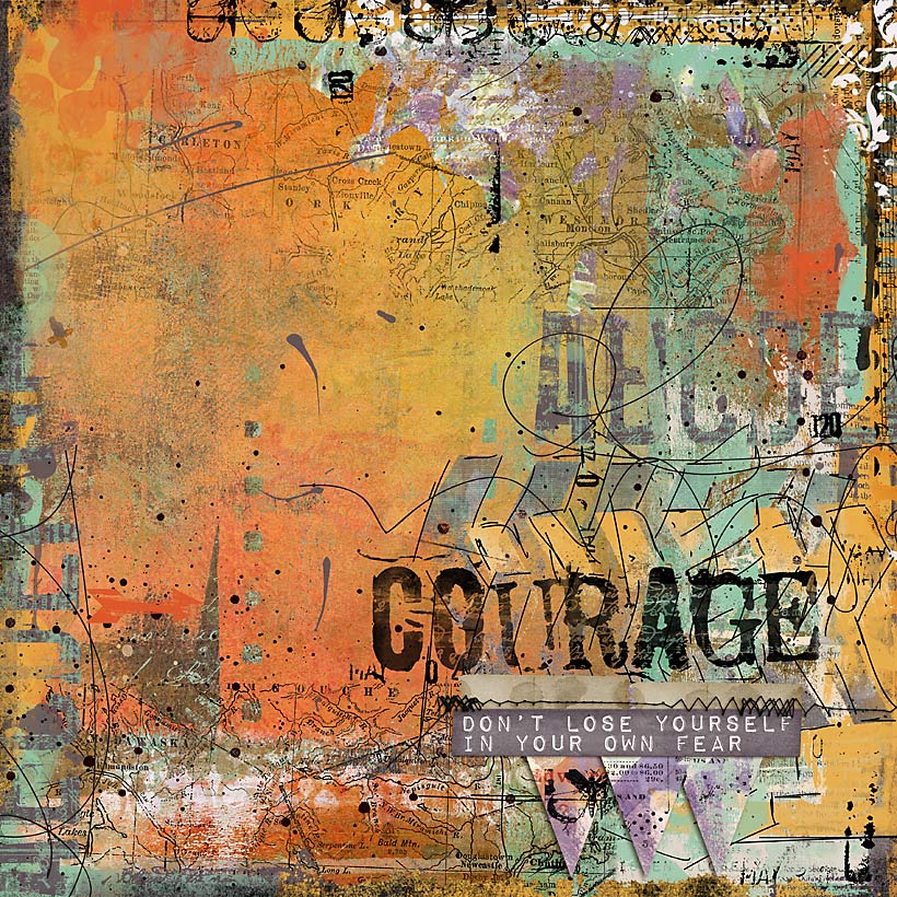
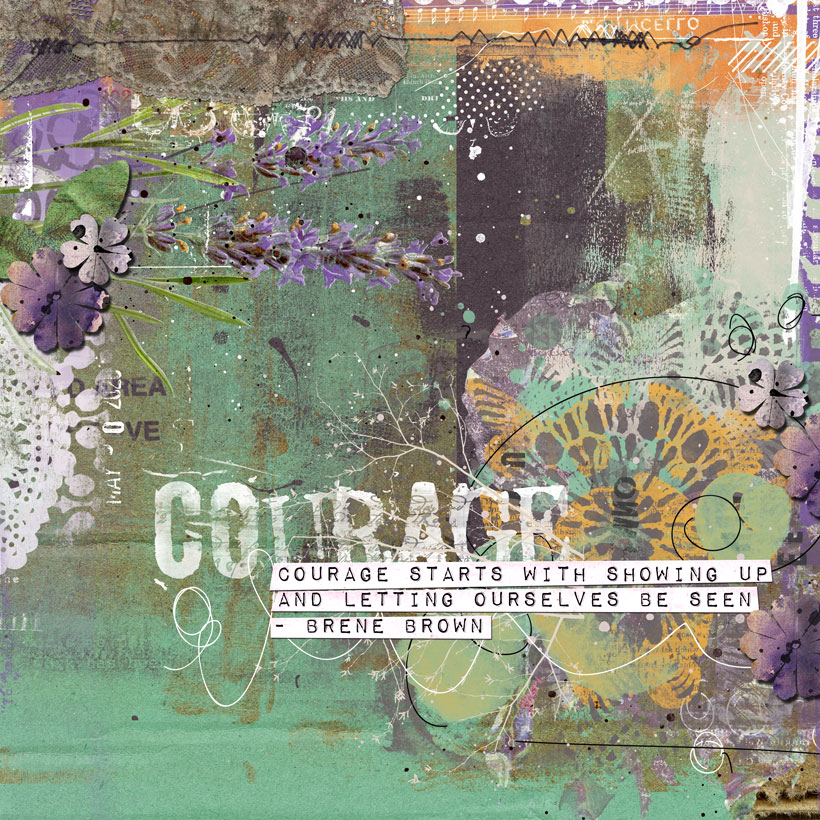
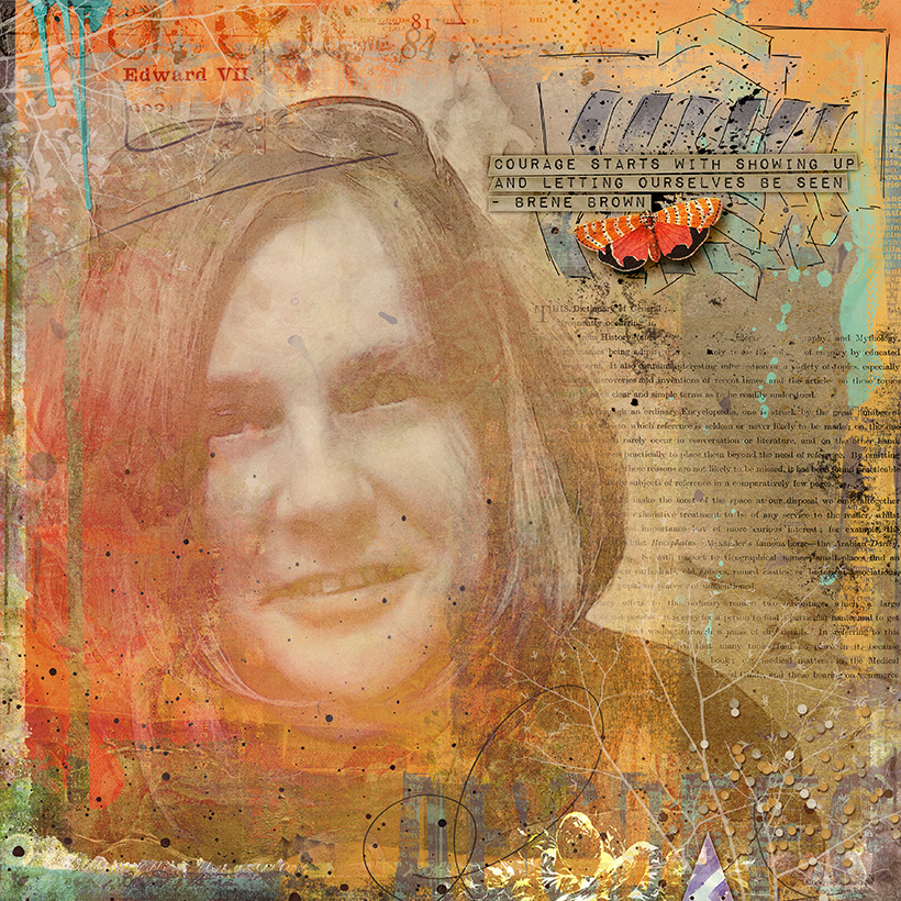
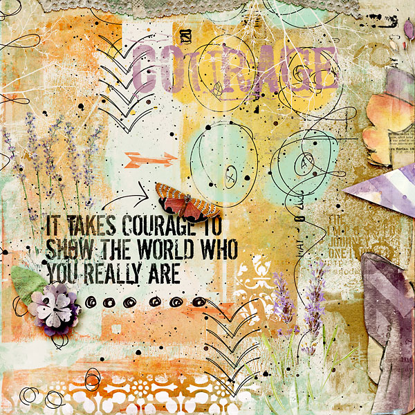
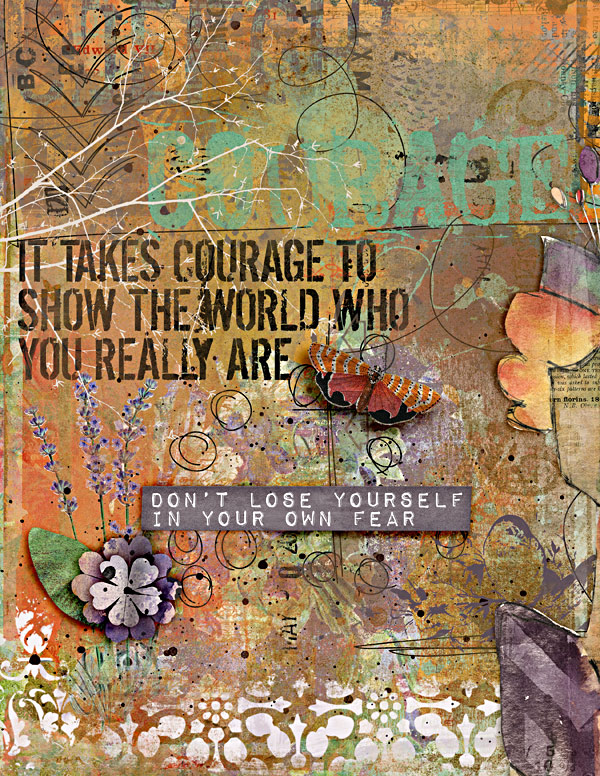
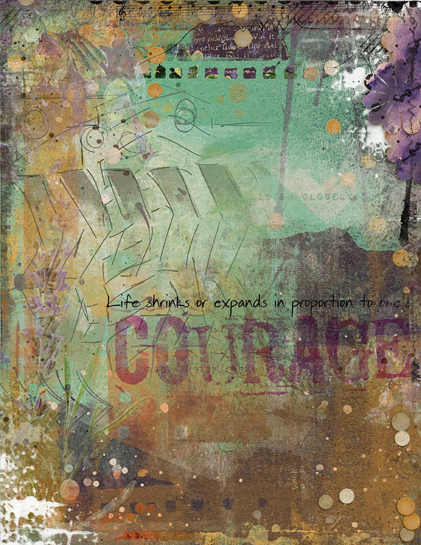
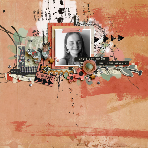
Here are some other examples of paper stacks working really well and how stamps have been used to create strong composition and add texture.

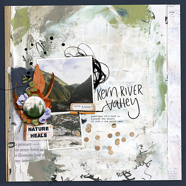
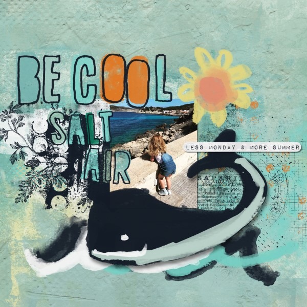
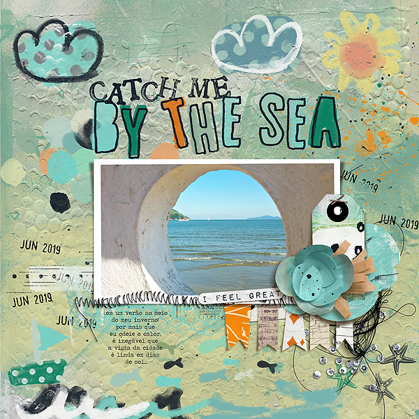
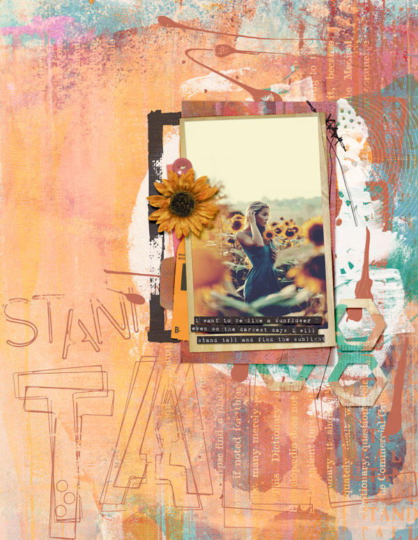
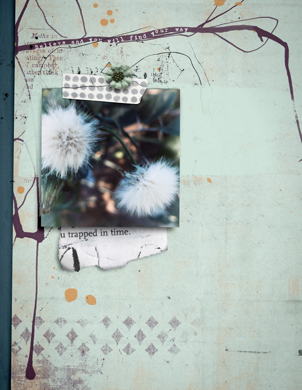
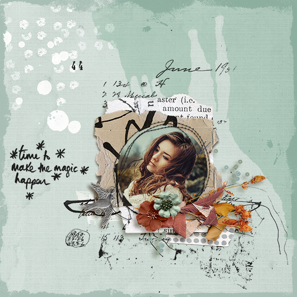
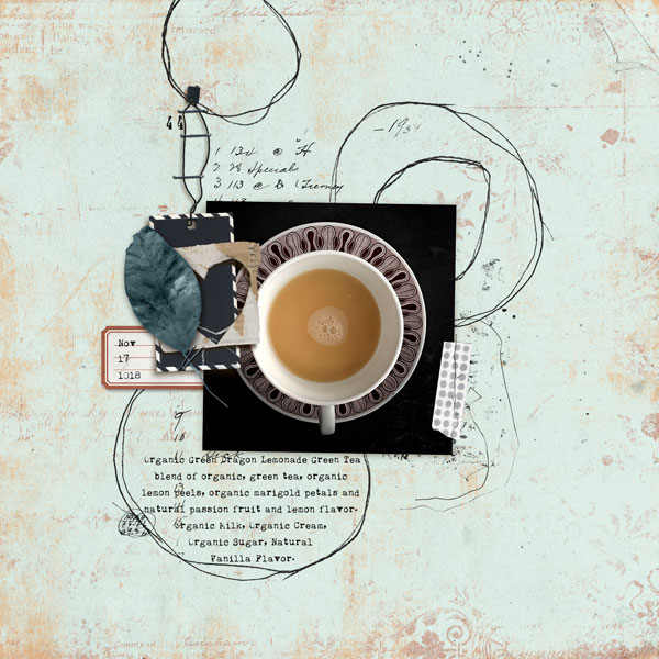
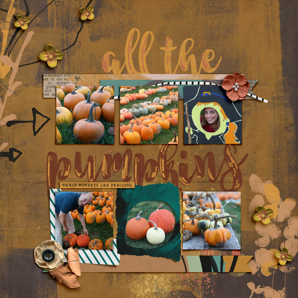
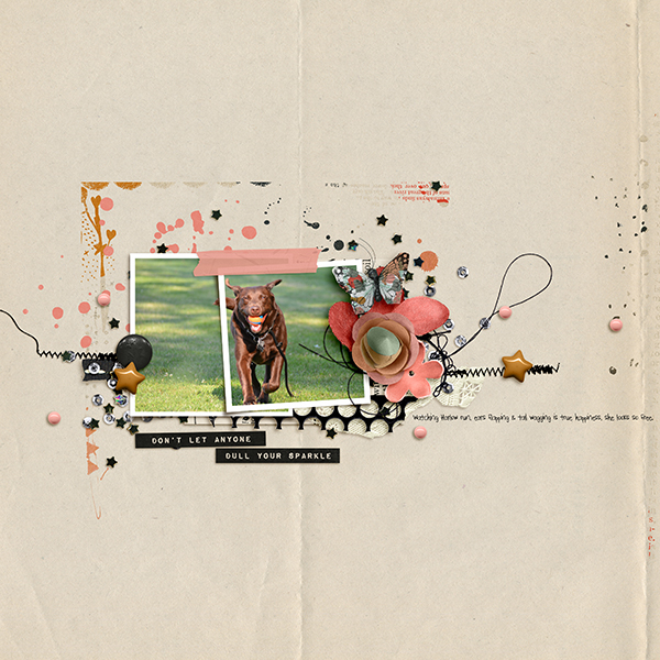
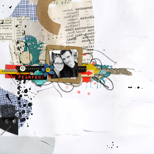
I created this additional layout after I made this video with the new Stellar Memory Pockets Monthly and my New Stellar Add ons.

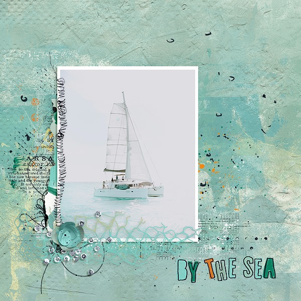
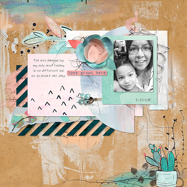
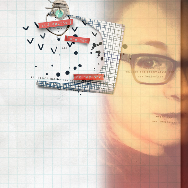
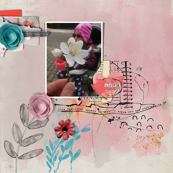
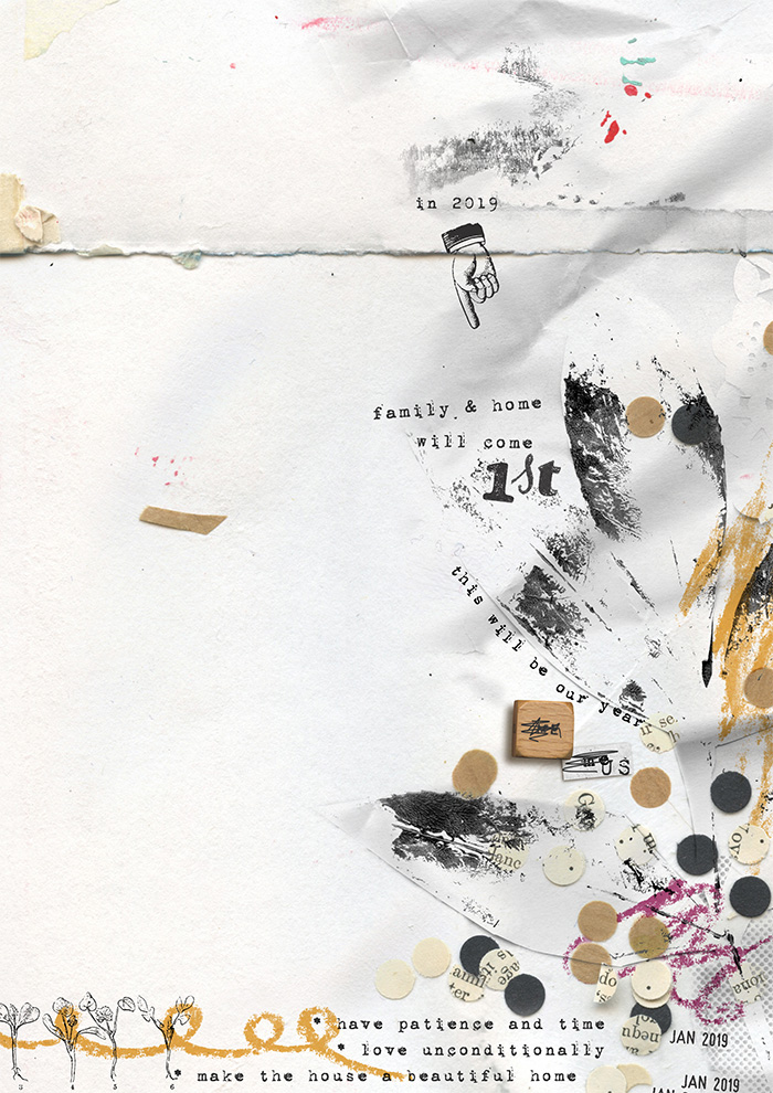
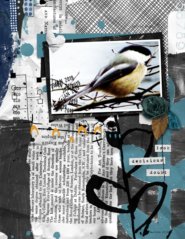
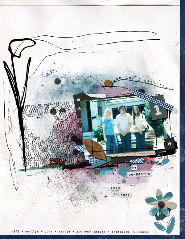
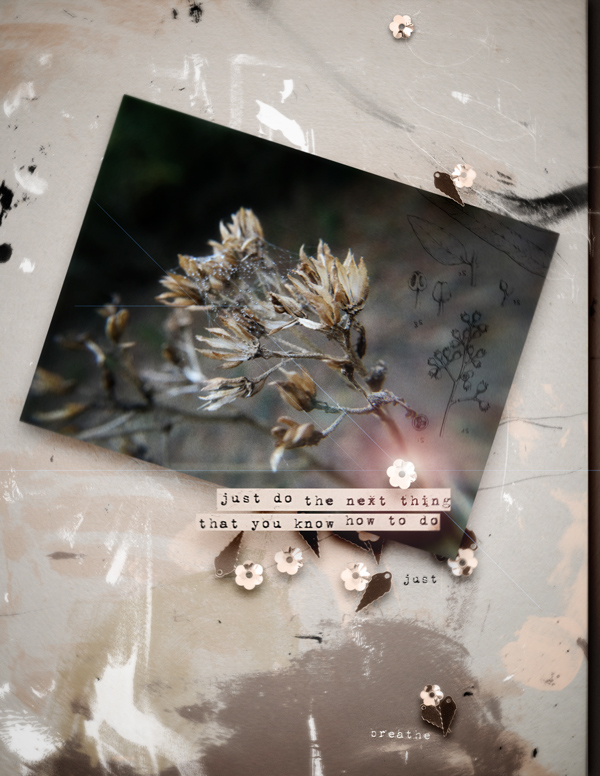
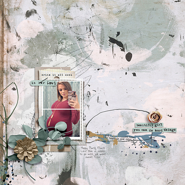
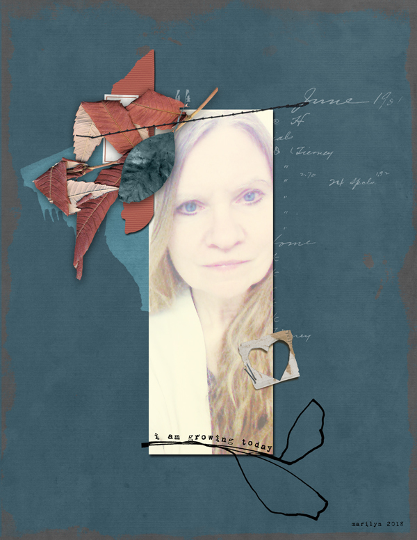
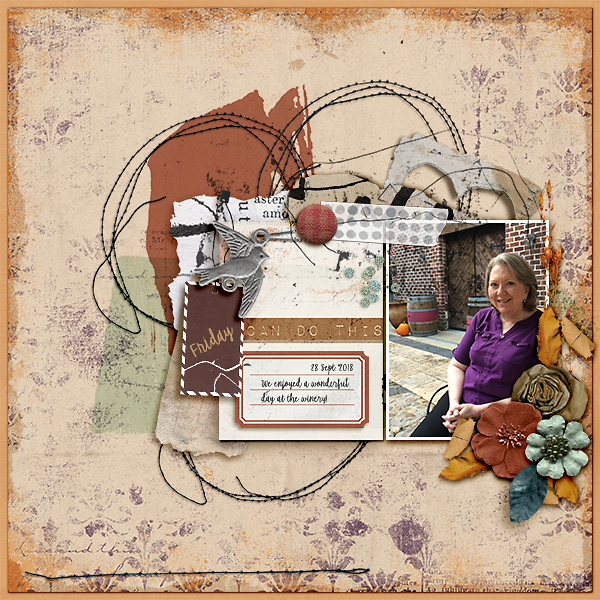
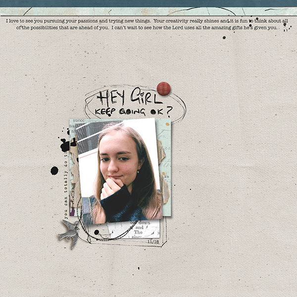
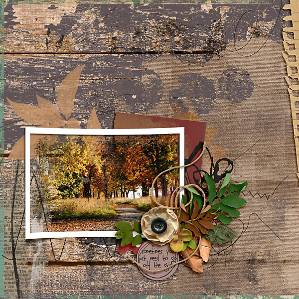
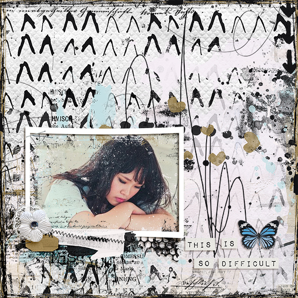
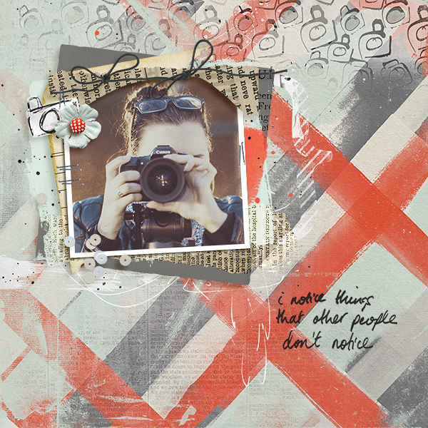
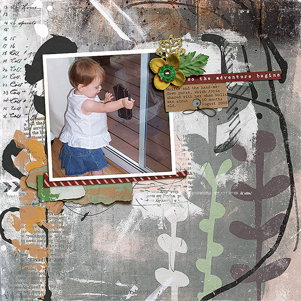
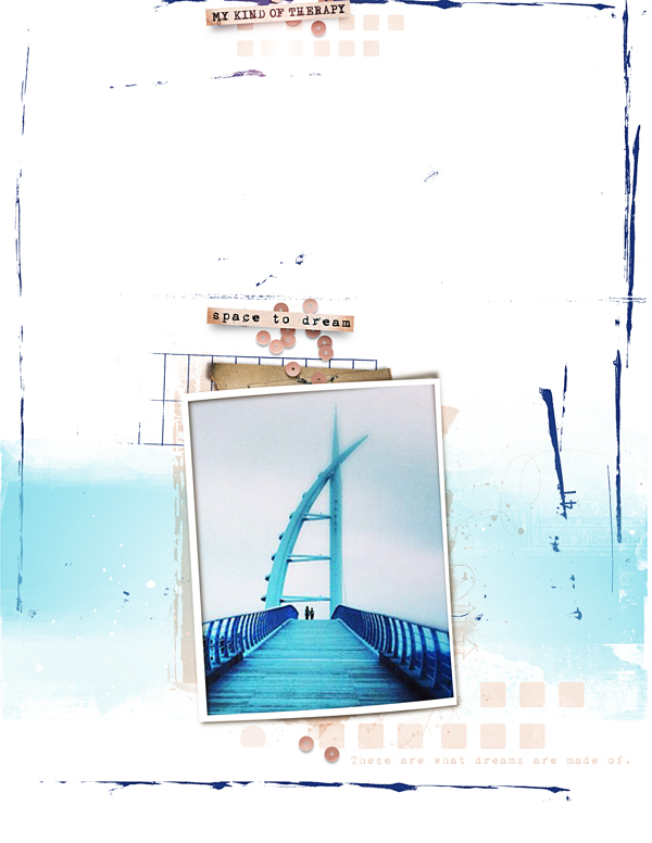
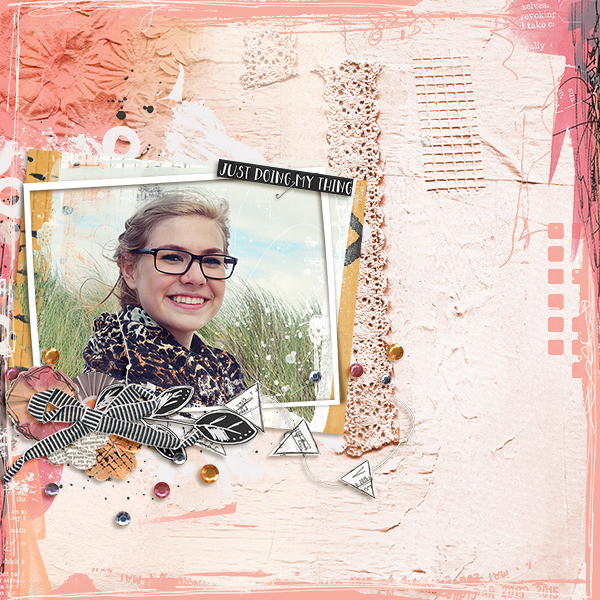
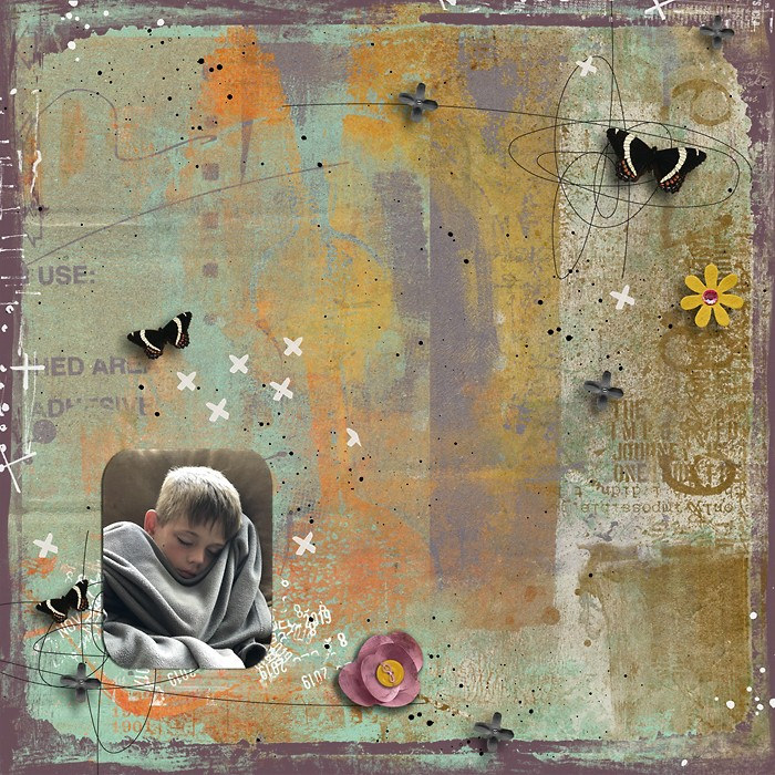
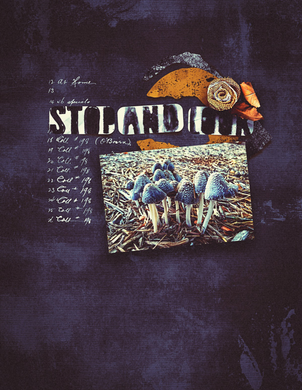
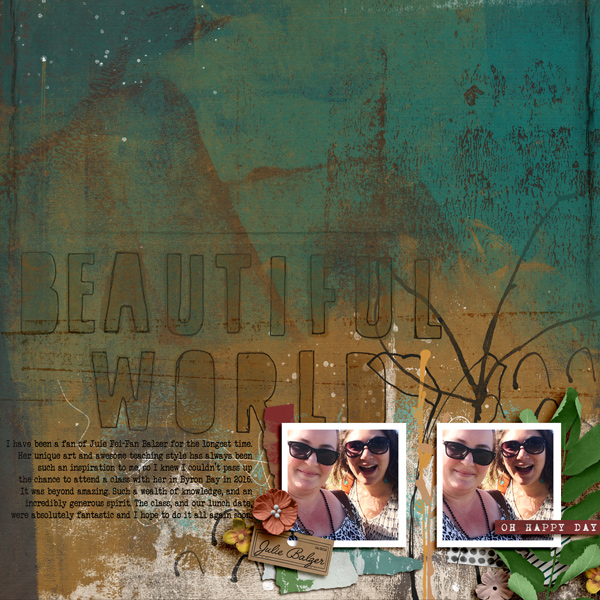
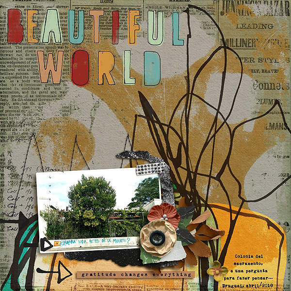
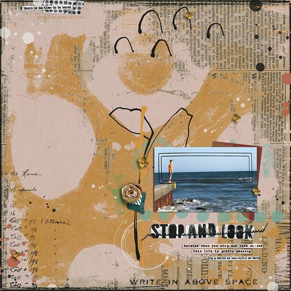
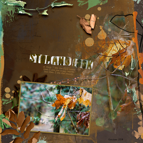
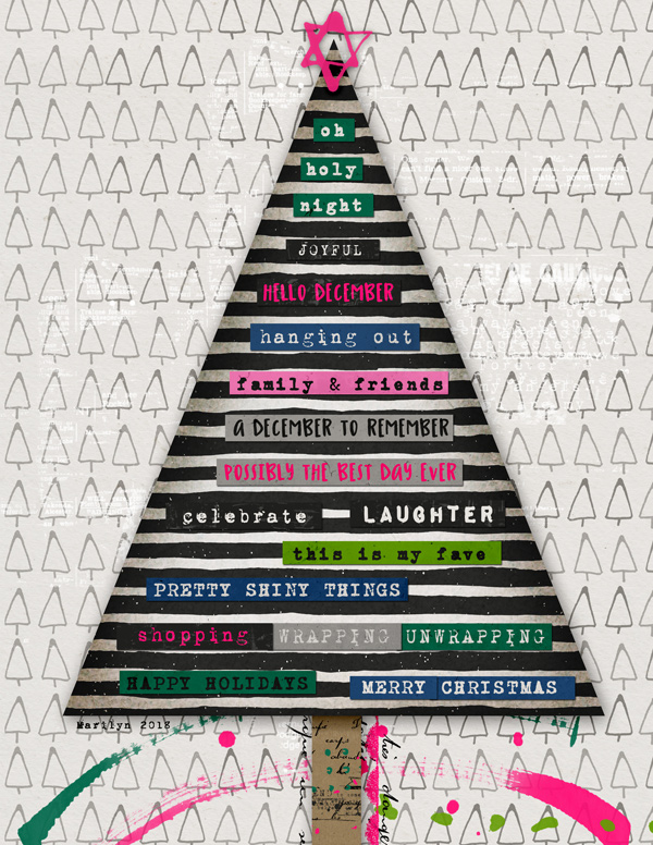
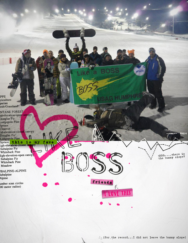
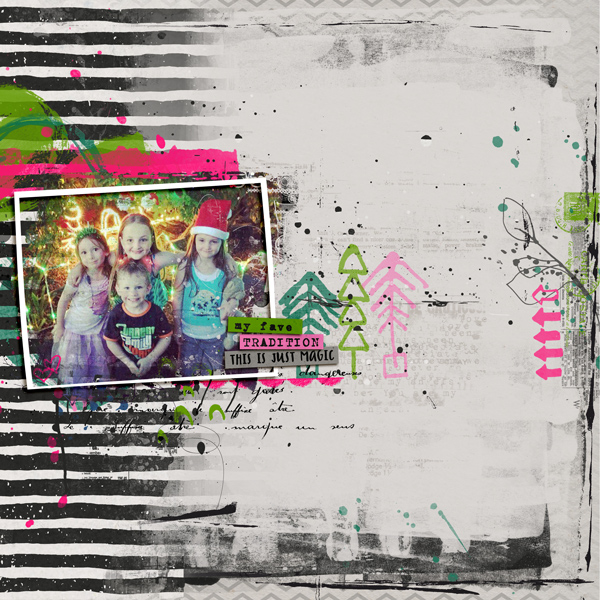
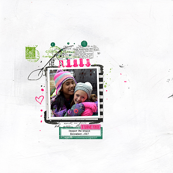
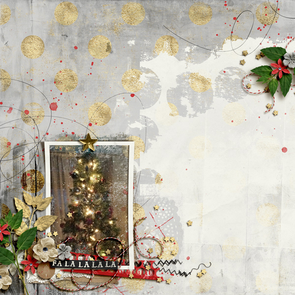
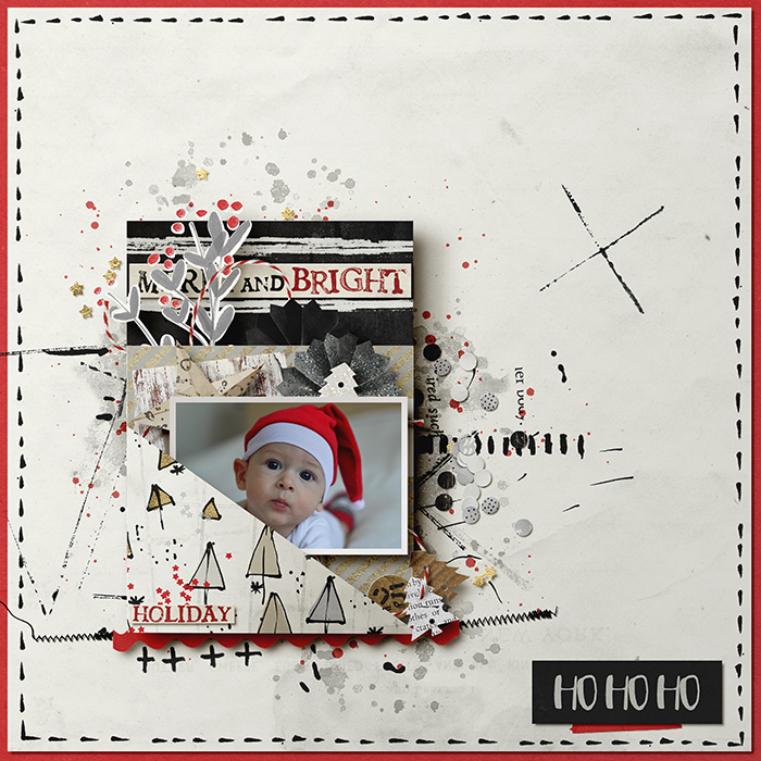
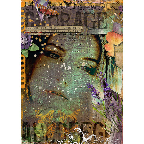
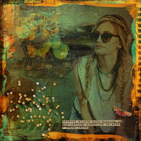
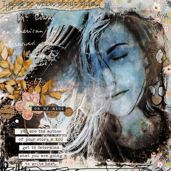
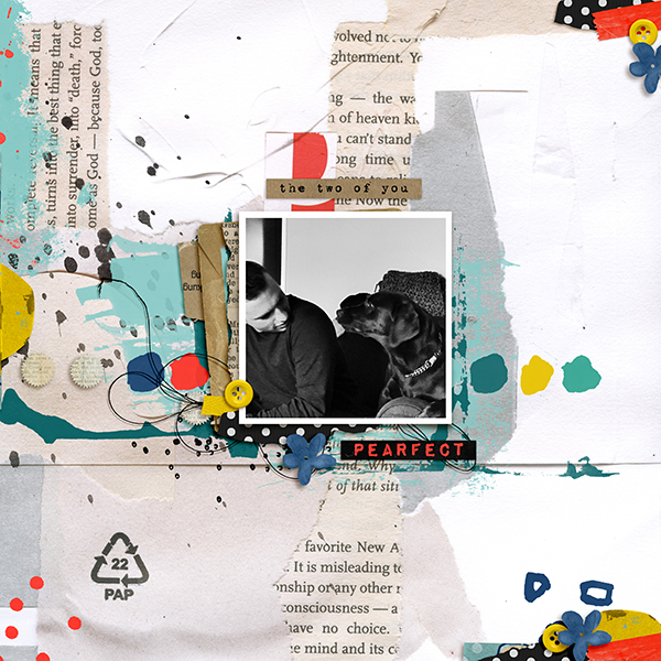
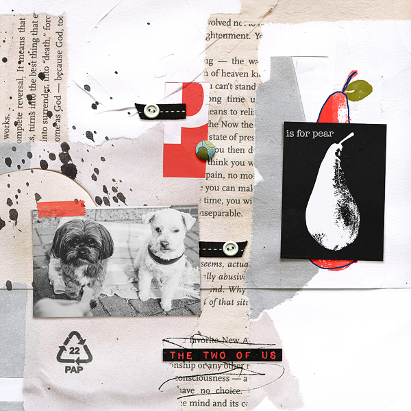
Whilst the ephemera cluster in this one is simplistic I used the techniques to elongate my composition away from my photo towards the area of white space.

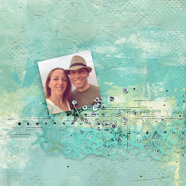
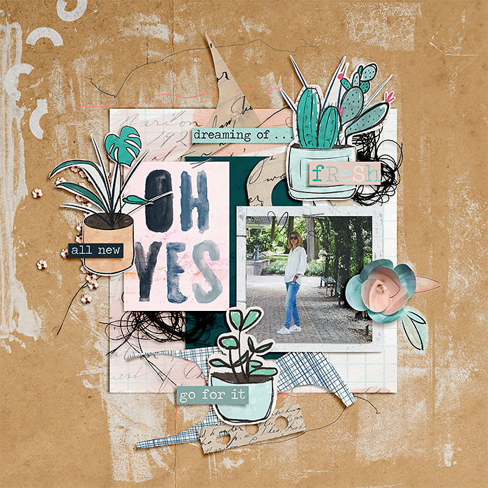
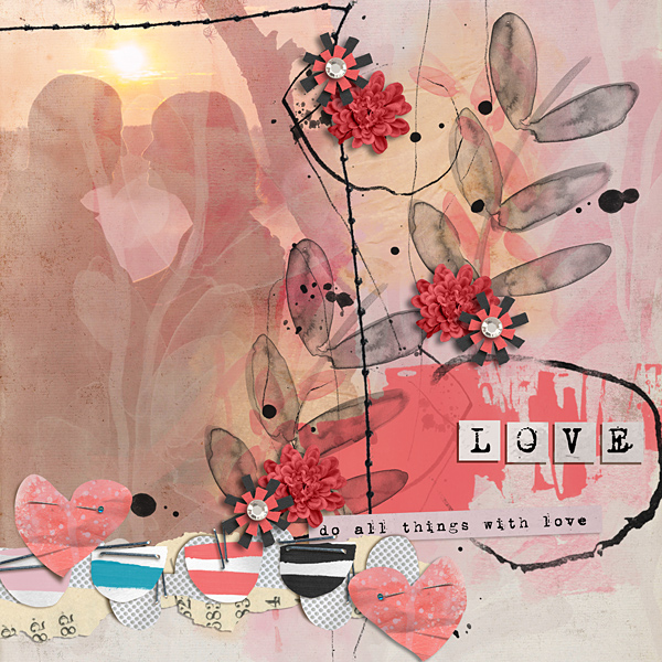
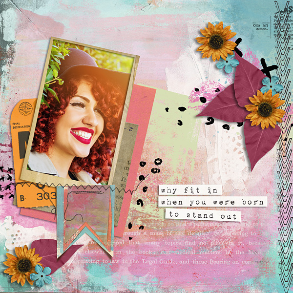
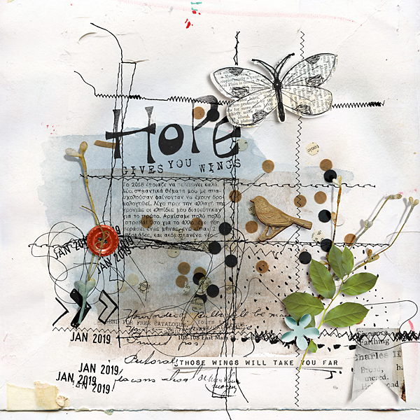
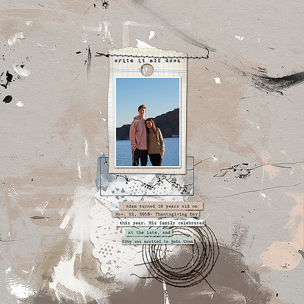
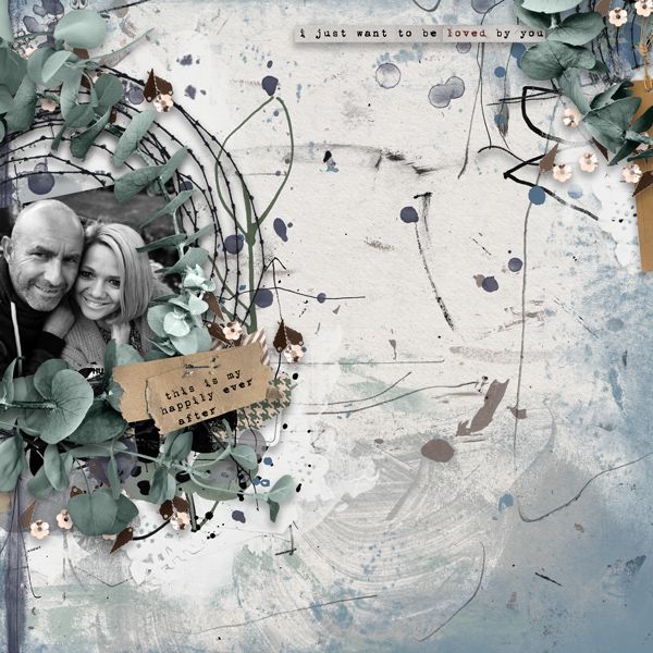
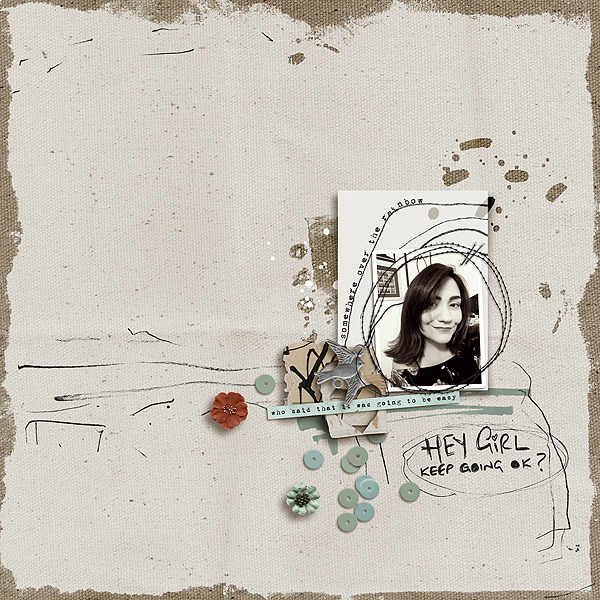
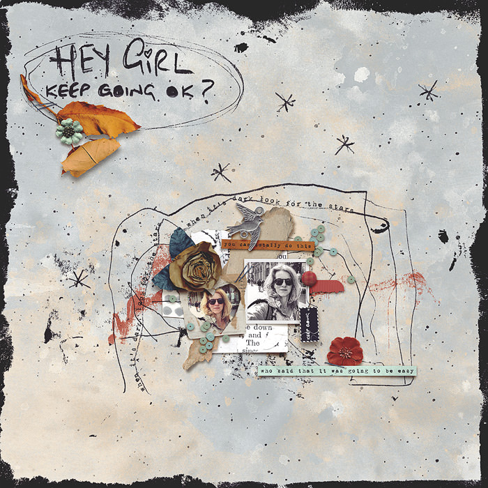
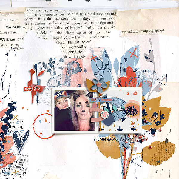
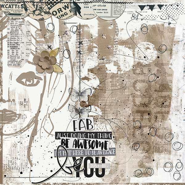
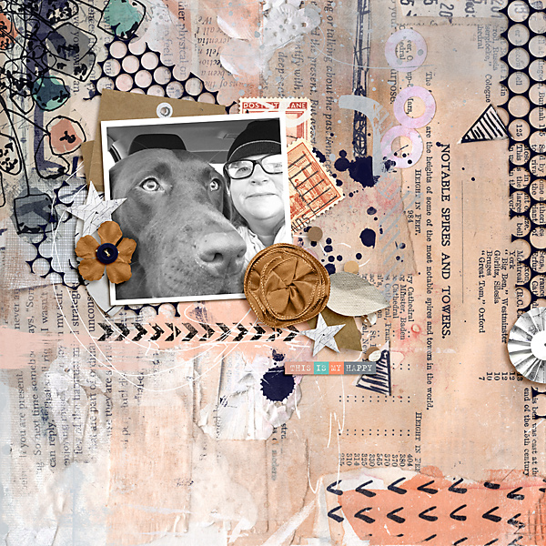
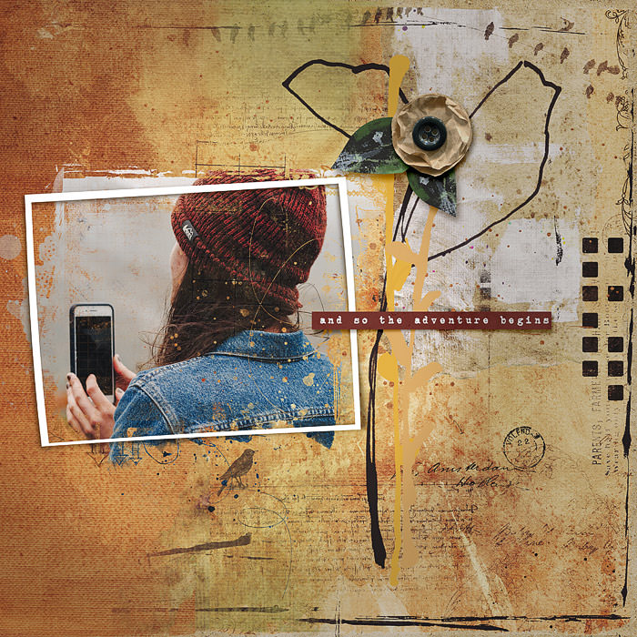
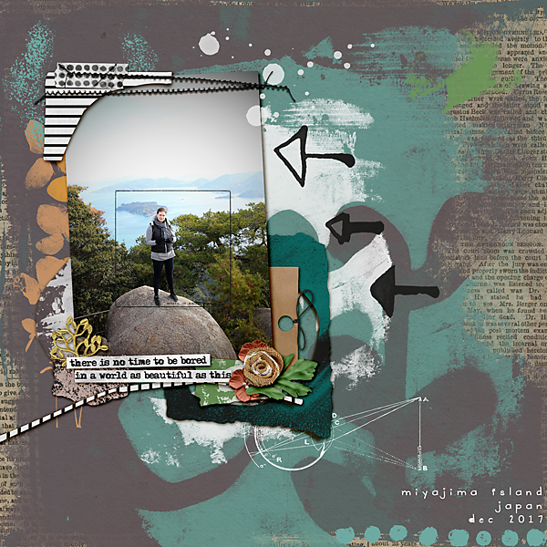
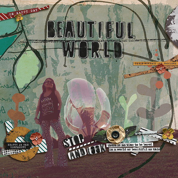
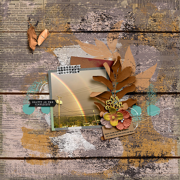
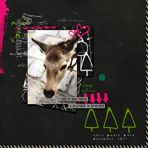
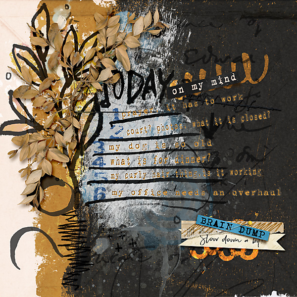
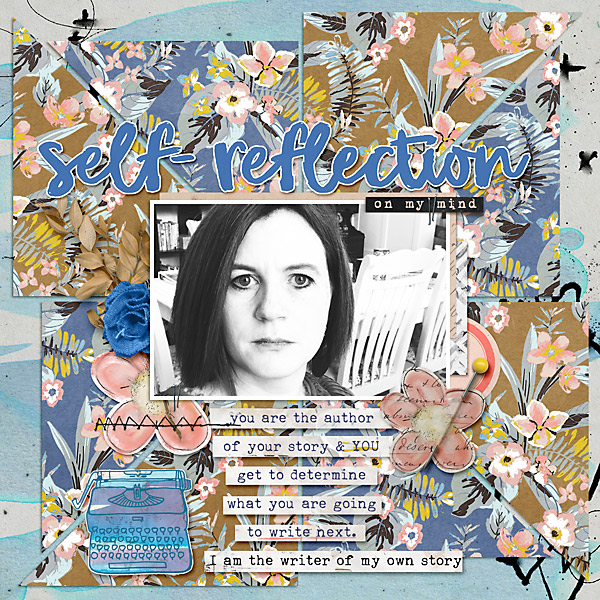
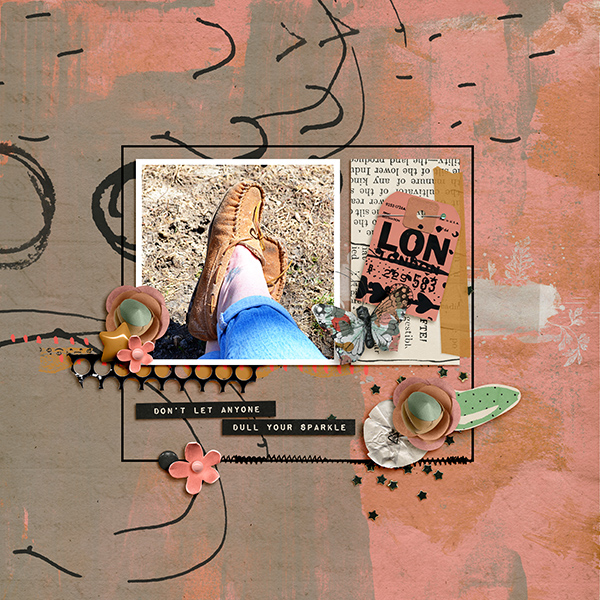
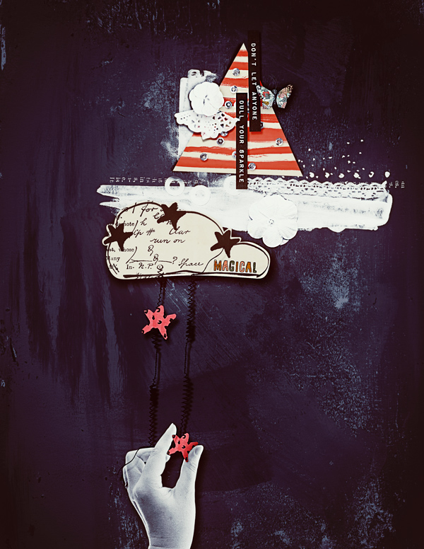
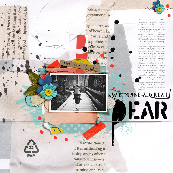
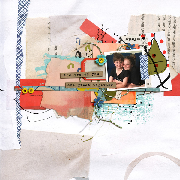
Aly has used ephemera to create simple clusters to mount her photos and kept the colours minimal.

She has used a combo of plain tickets, some including text and some pattern and pops of blue. Coupled with a combo of botanical stamps, splatters, text fragments and a bold dimensional cluster and just a few trailing threads and scatters, her ephemera and stamps add so much to her page.

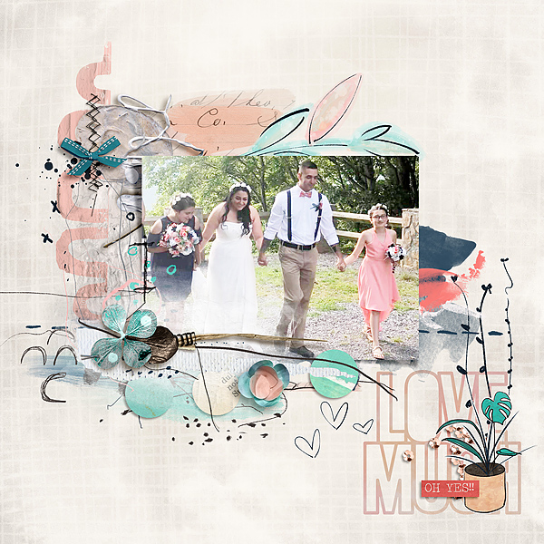
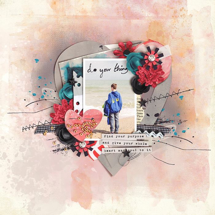
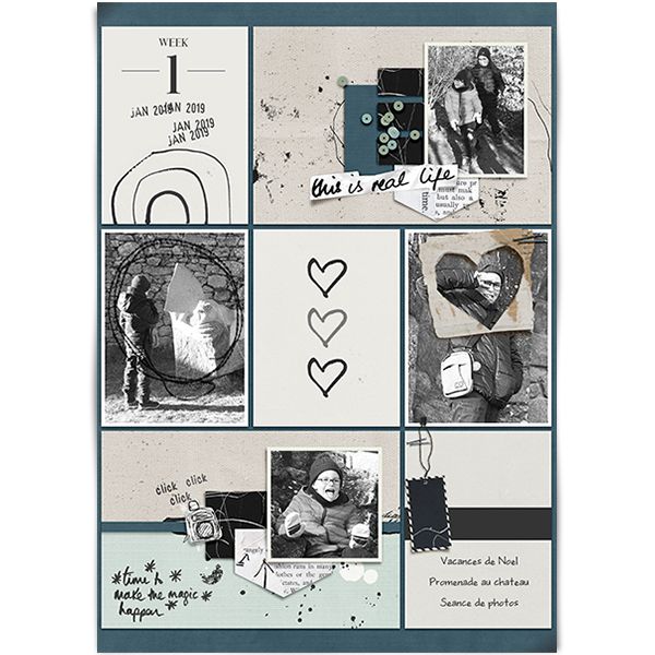
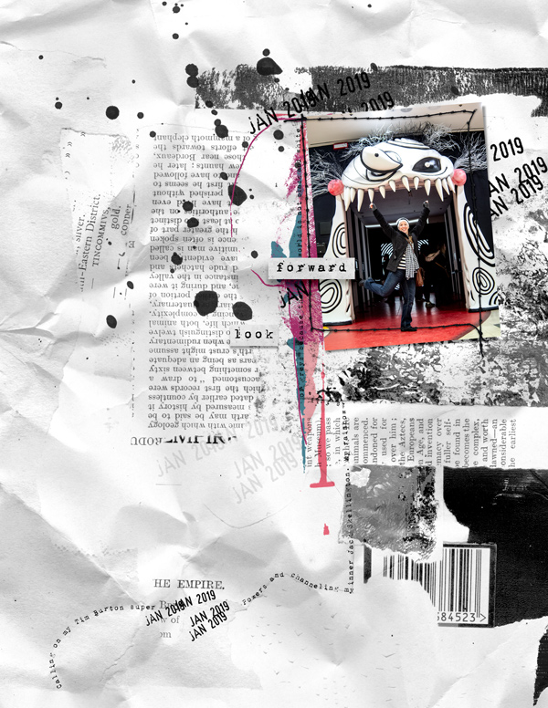
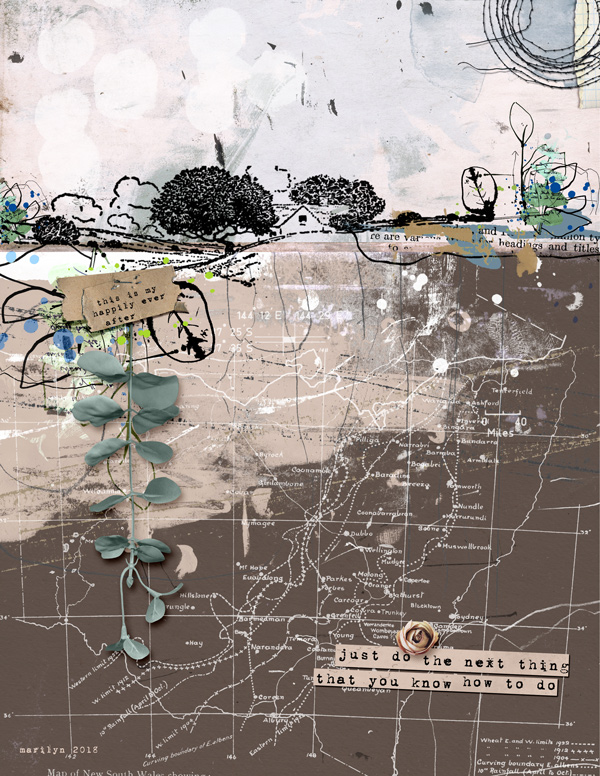
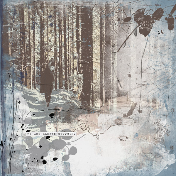
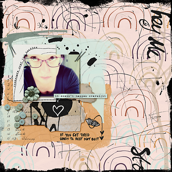
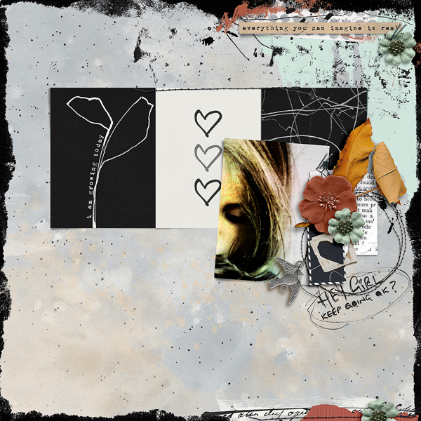
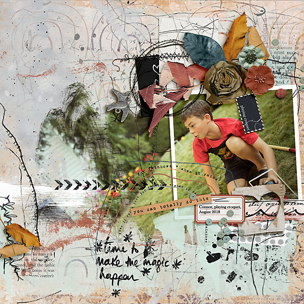
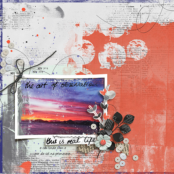
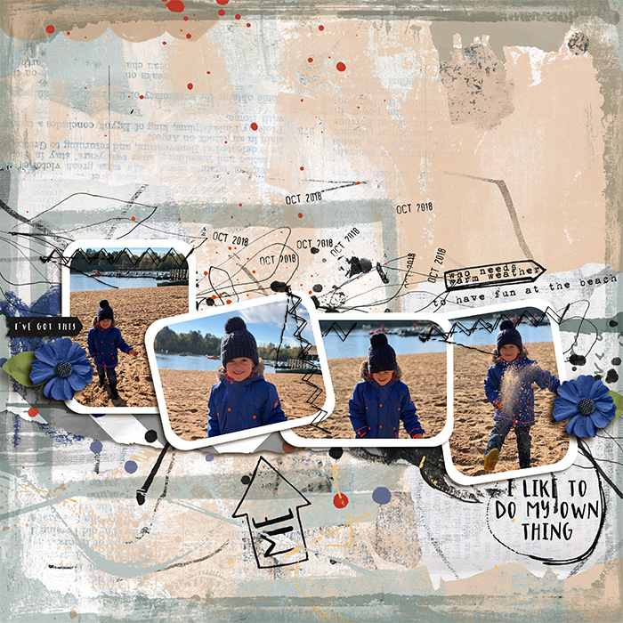
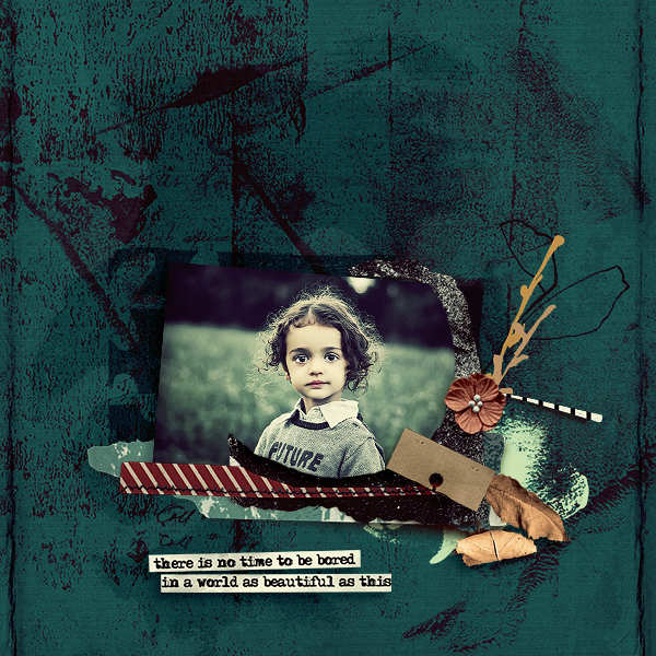
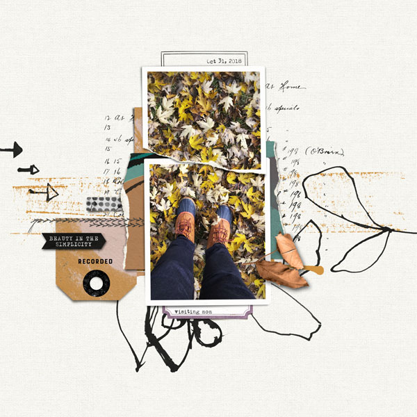
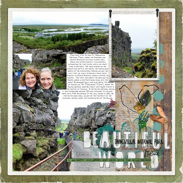
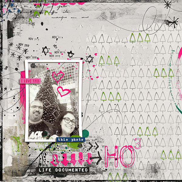
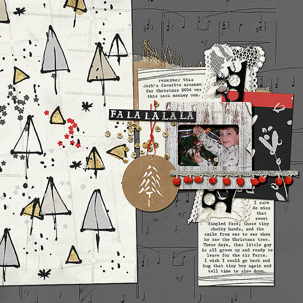
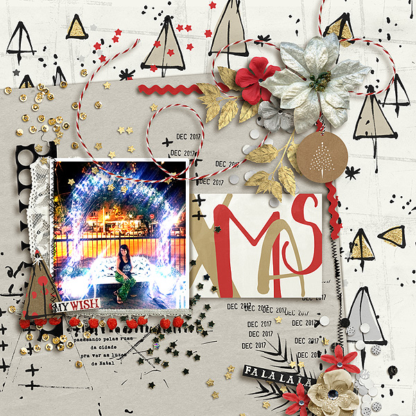
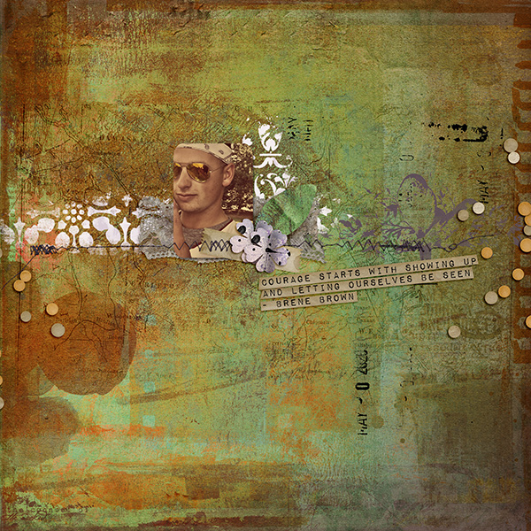
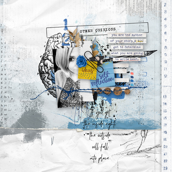
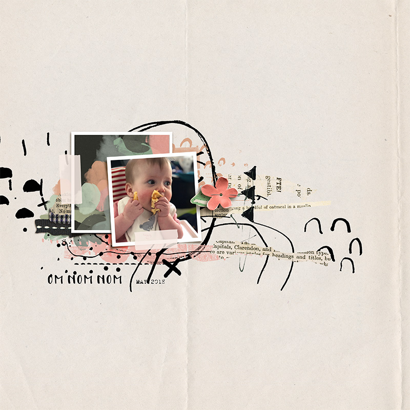
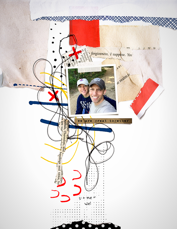
Dalis uses a combination of circular motions around her photo and then uses the strings, stamps, word art and stamps to elongate along the width of the page.

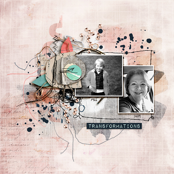
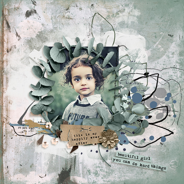
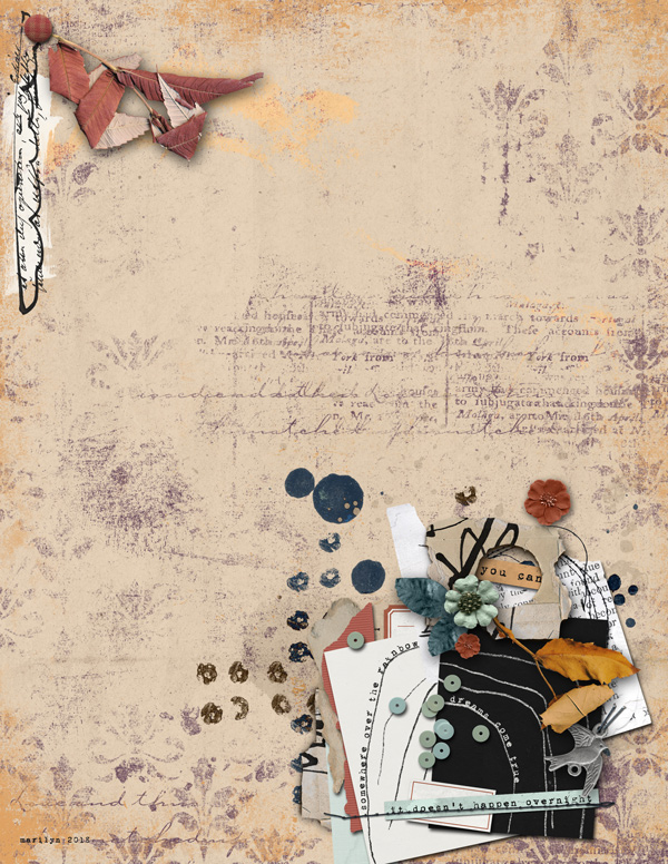
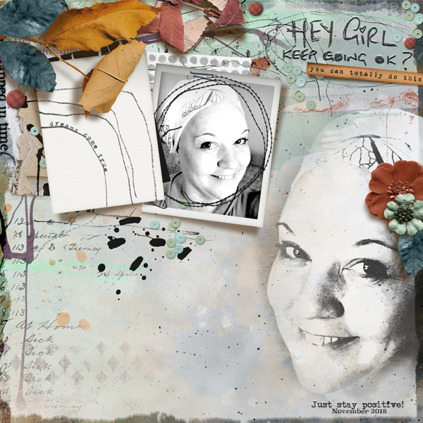
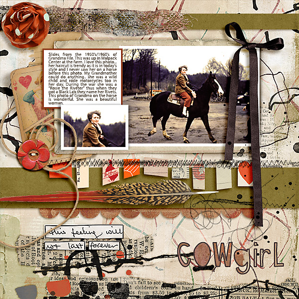
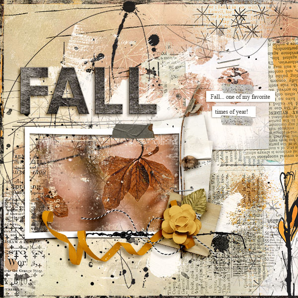
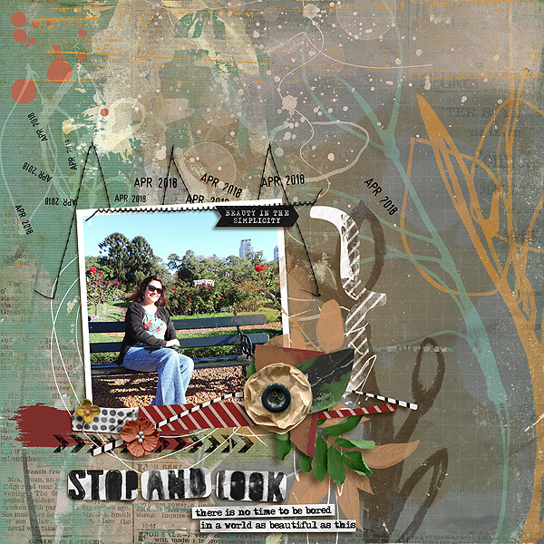
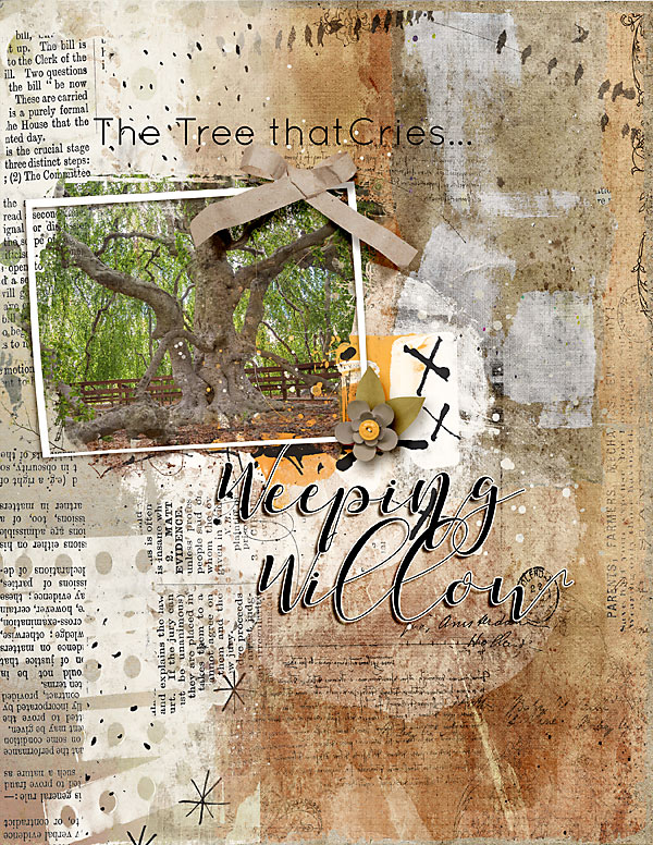
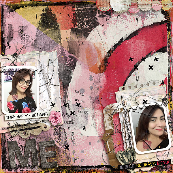
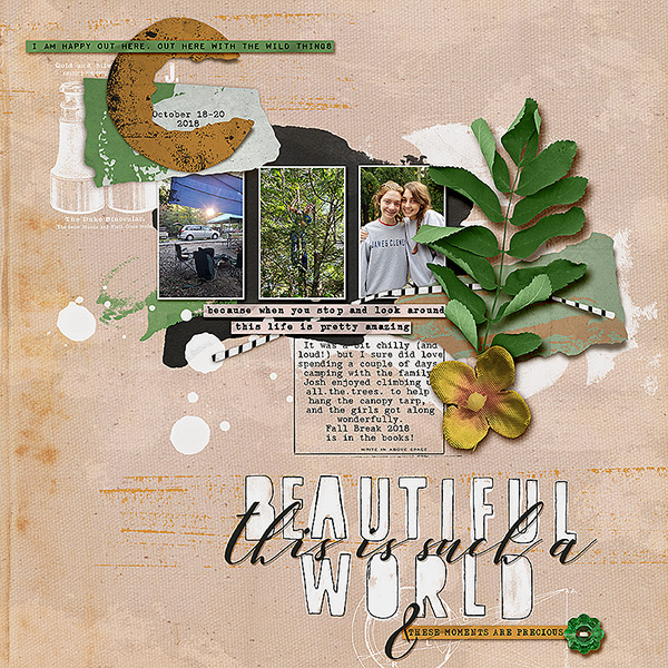
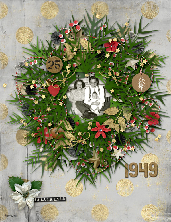
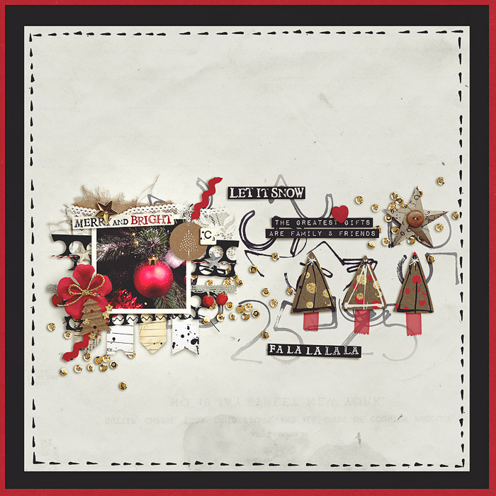
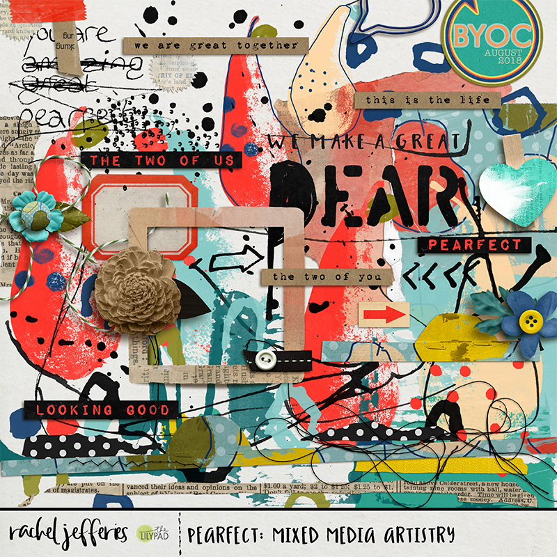
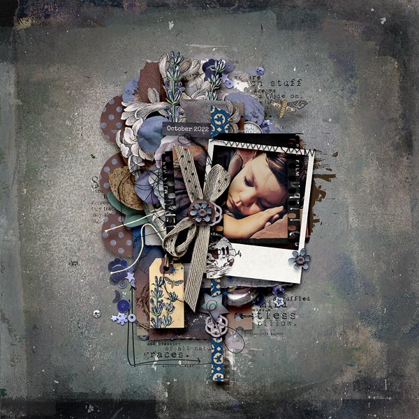
The ultimate cluster from Sheri!

A great mix of pattern and print and a minimal colour palette coupled with lovely long trailing strips of paper to elongate the page, text stamps, arrows and paint to elongate and add texture and movement, trailing threads and a sprinkling of elements to finish.

So much gorgeous stacking here and the stamps and paint on the painted background finish it off so perfectly.

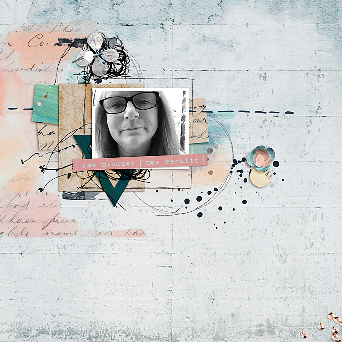
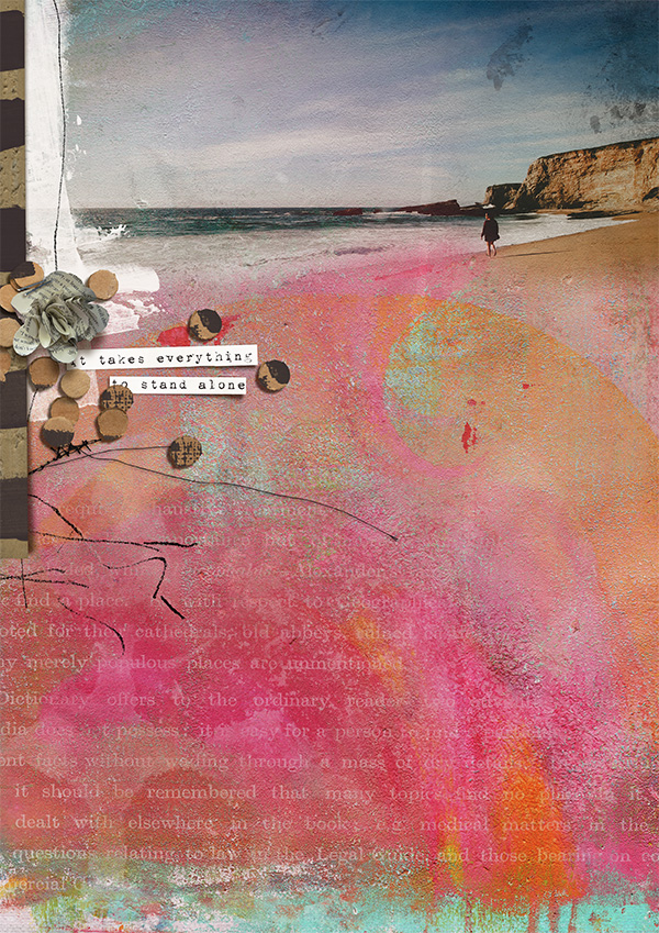
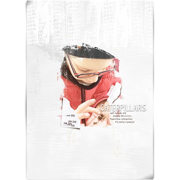
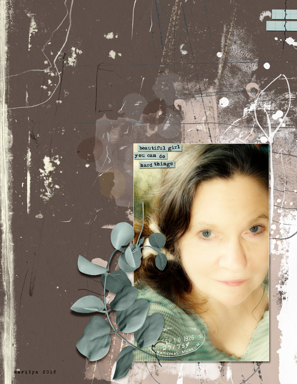
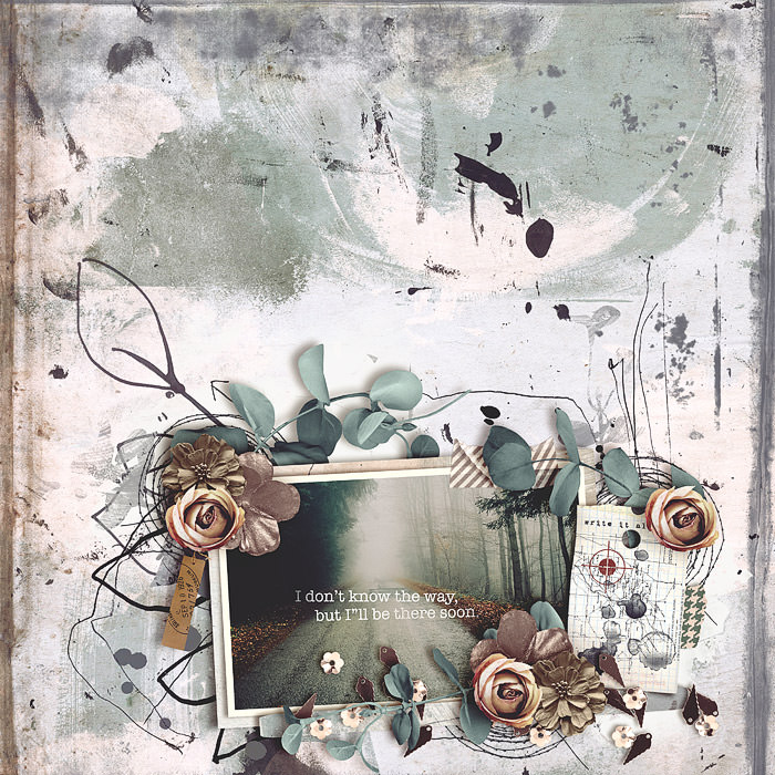
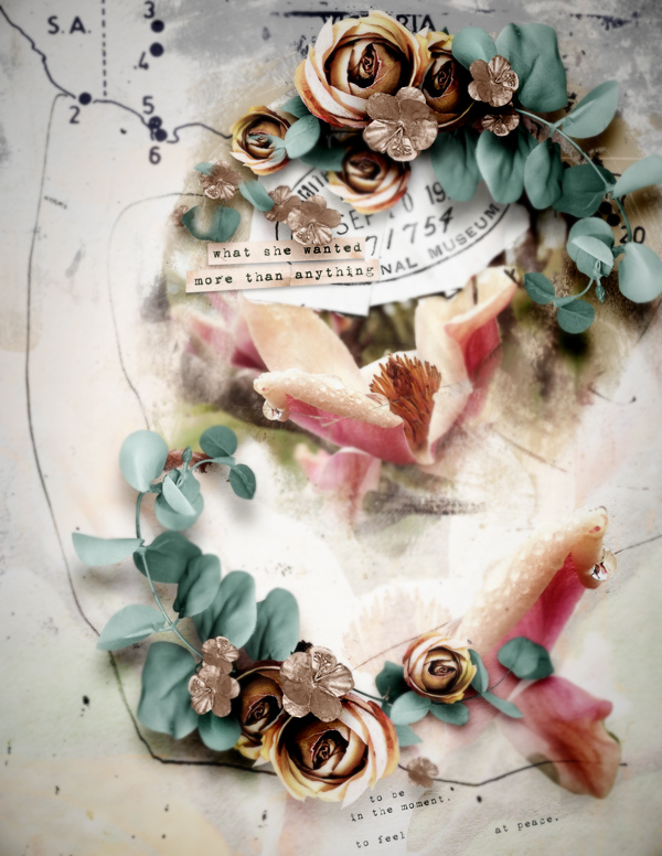
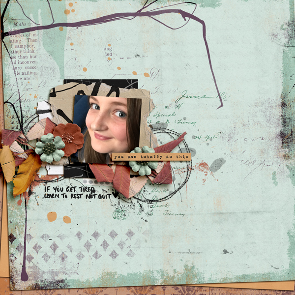
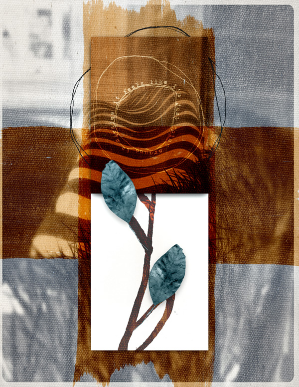
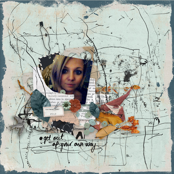
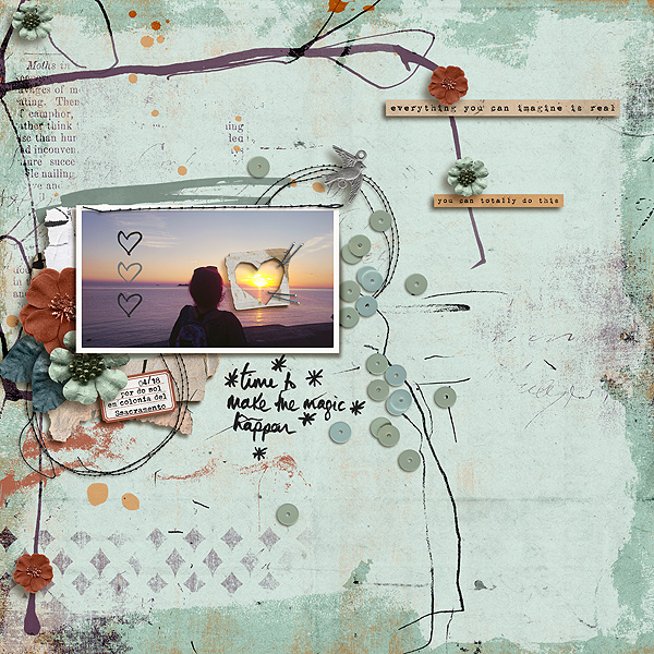
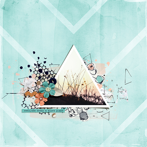
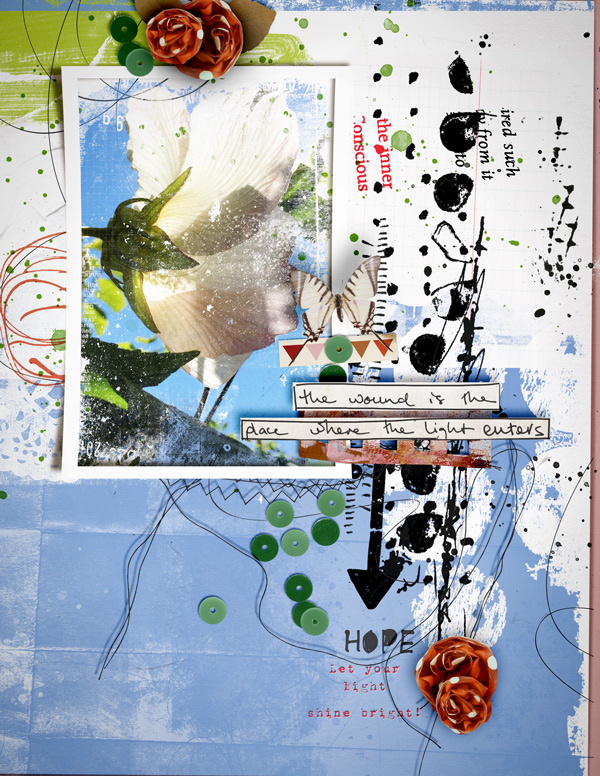
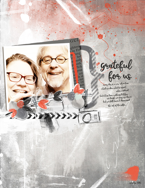
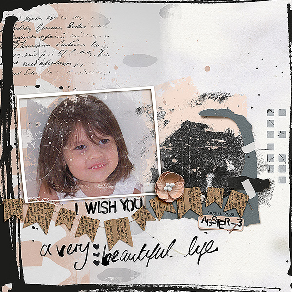
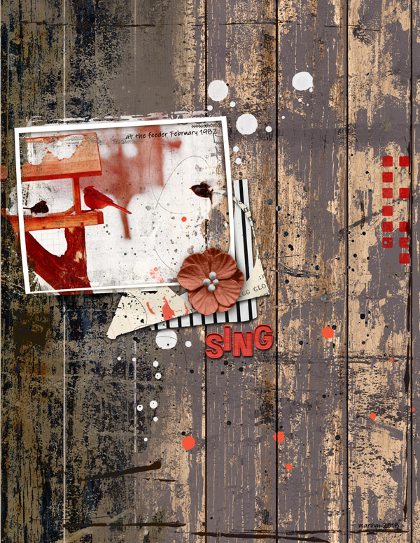
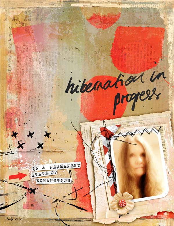
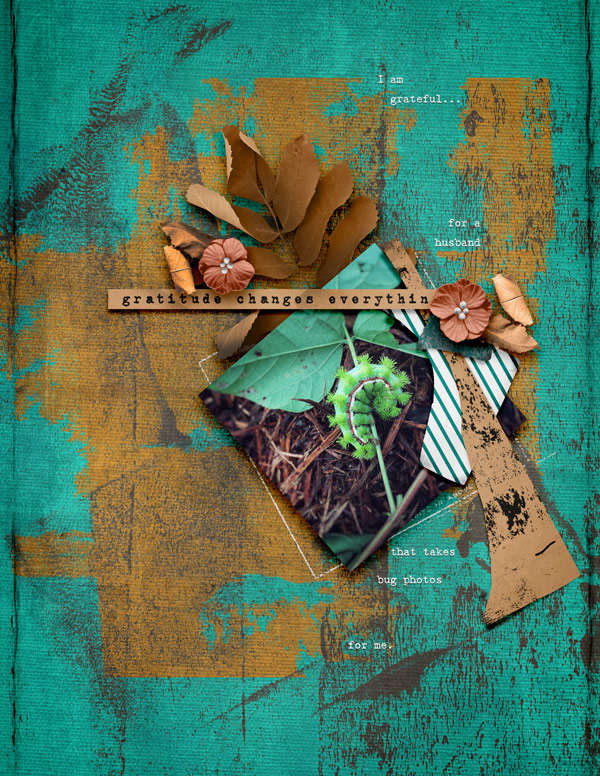
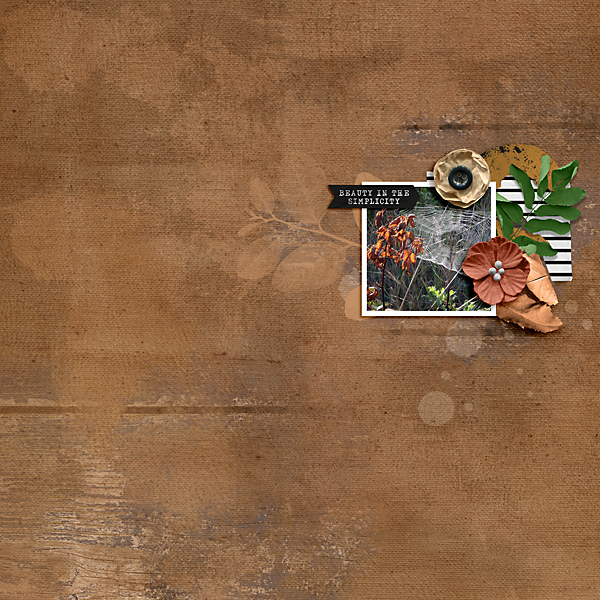
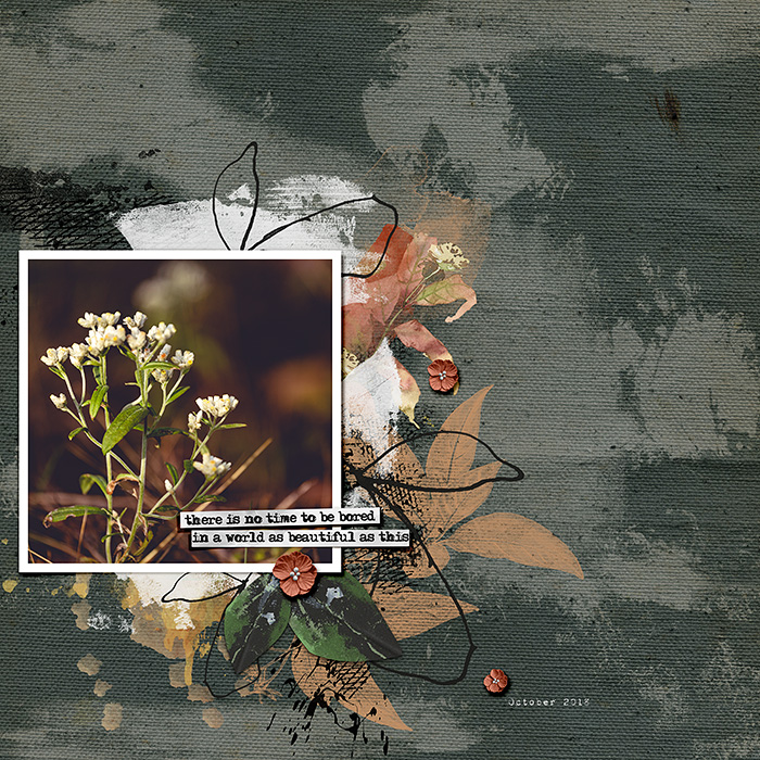
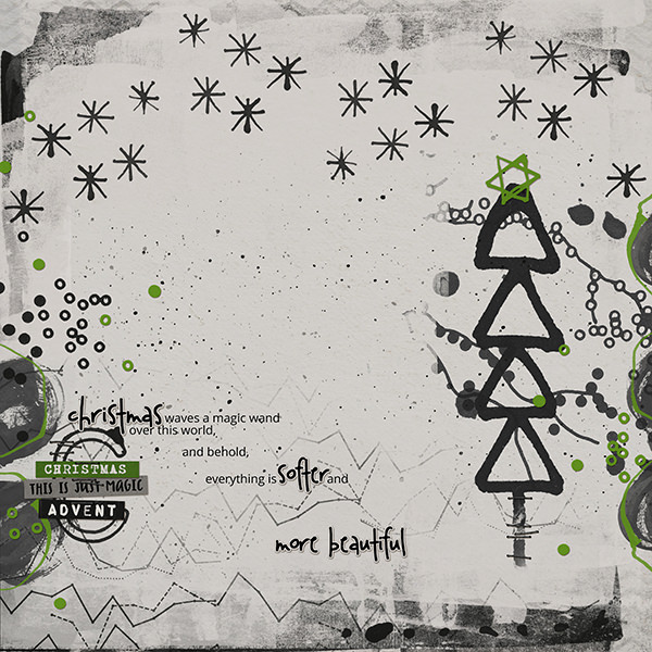
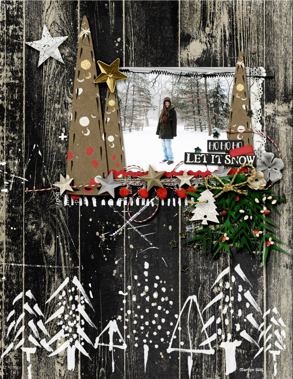
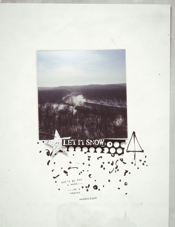
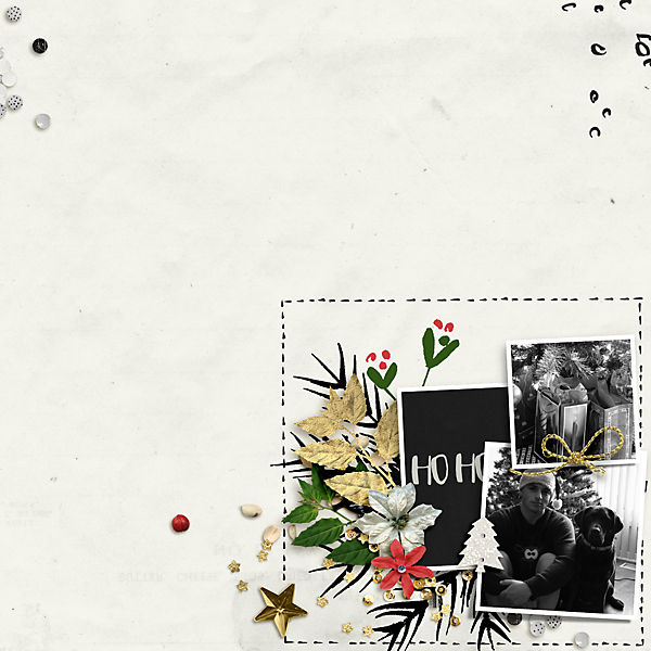
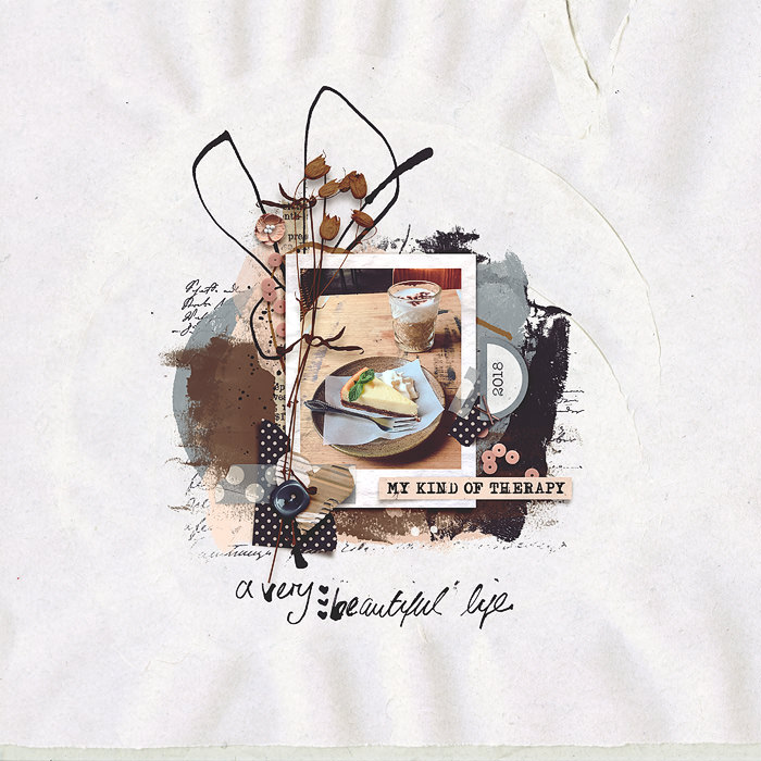
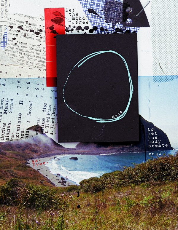
Peace and serenity here from Marijke.

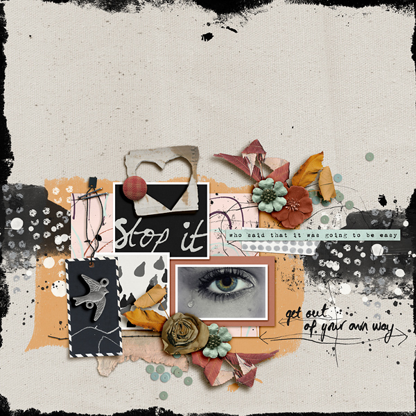
A more minimal example but oh so artsy with gorgeous ephemera layered intentionally to mount the top and bottom of the photo allowing it space to breathe.

She has used minimal stamps around the bottom and the corners beautifully and in an unimposing way. Everything is carefully placed just to to add just the right amount of stark black contrast and a little extra interest and texture to an otherwise perfect page.

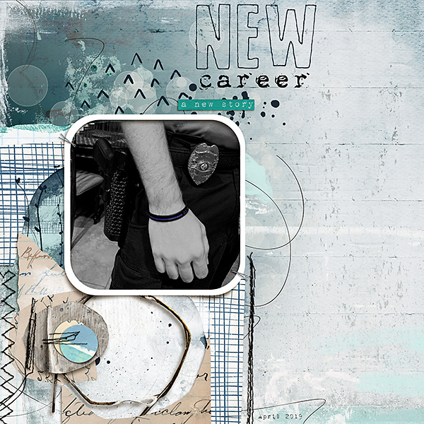
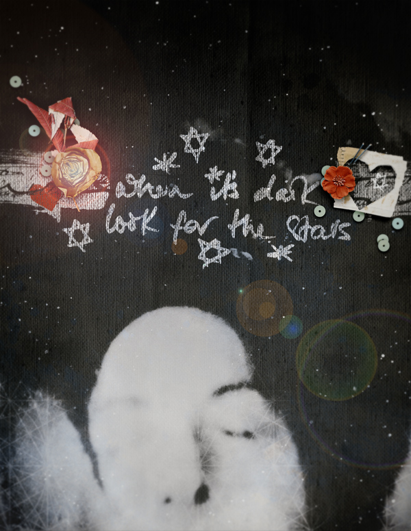
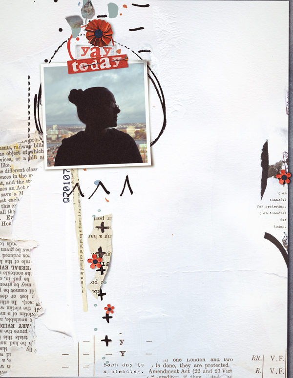
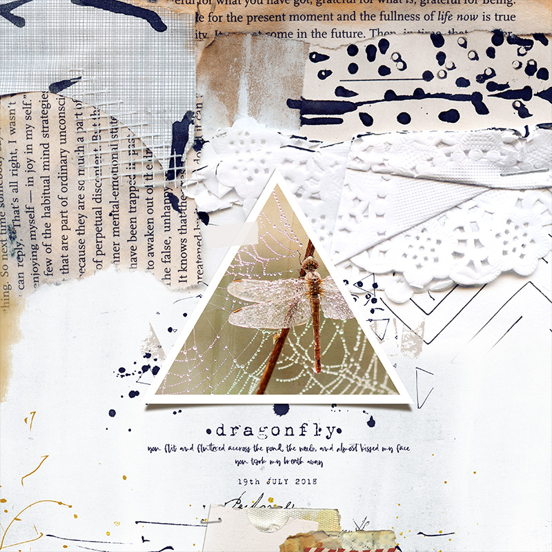
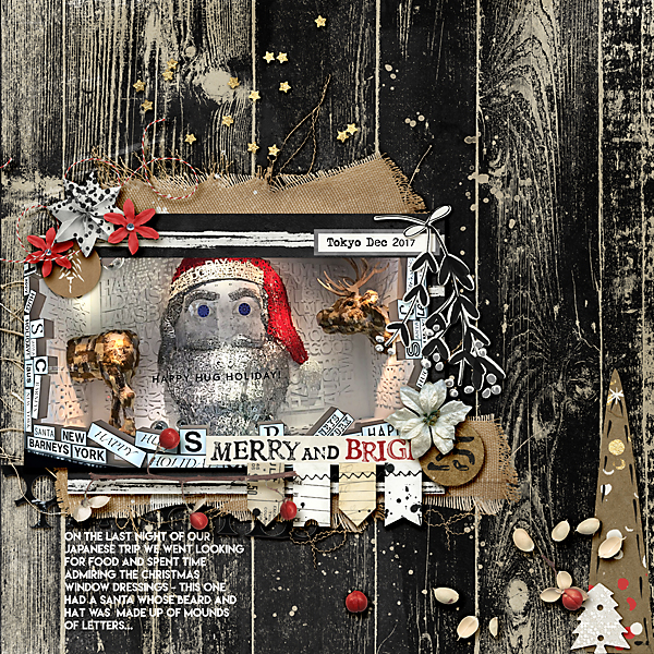
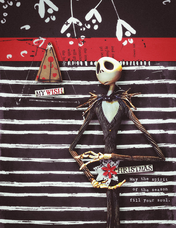
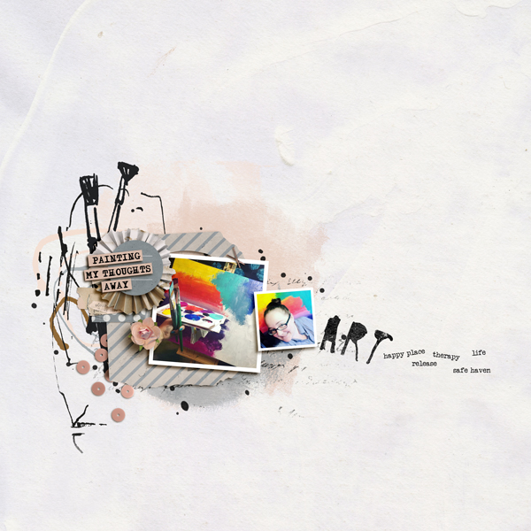
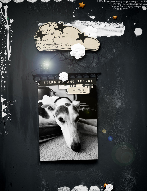
And last but by no means least, a gorgeous page by Roxana who dared to go bold with those gorgeous white stamps contrasting with her dark background.

I love how she also used that tall piece of grass so cleverly to draw attention to the crop of the photo and where we should be drawing out attention to!

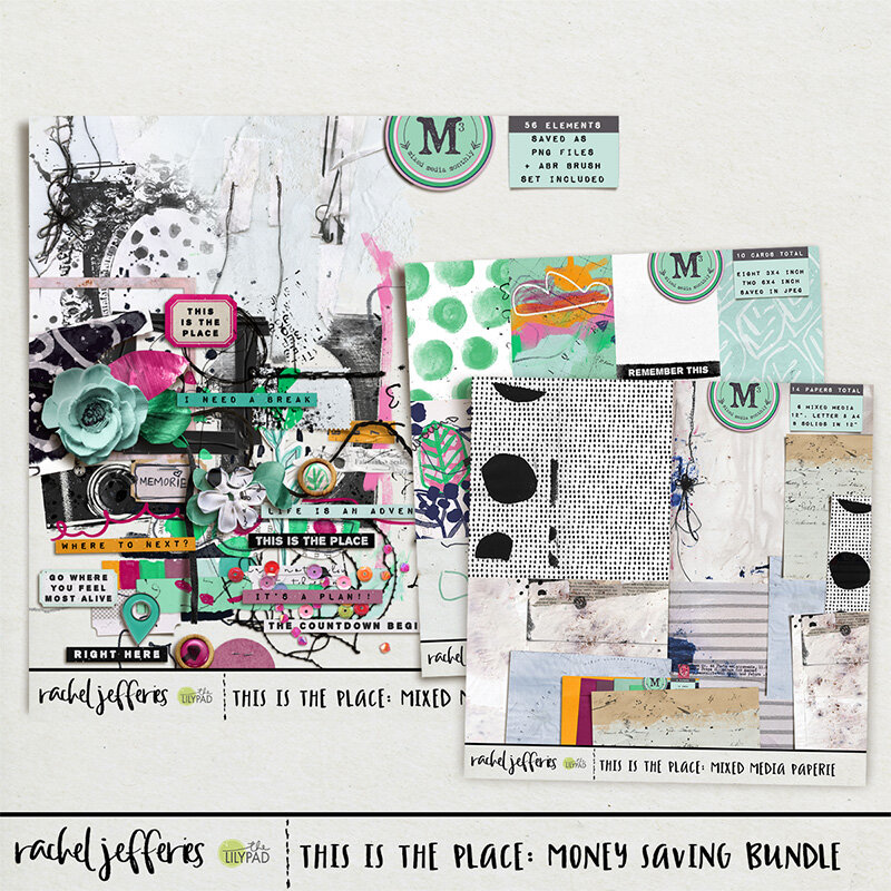
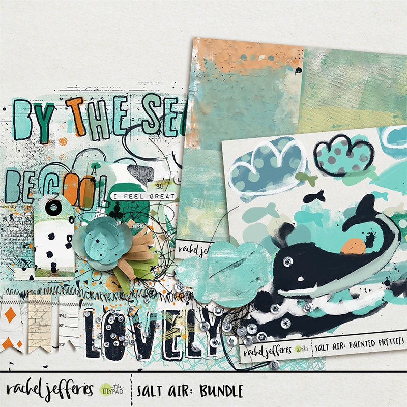
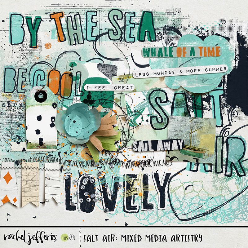
If you missed the announcements in my e-mails I'm excited to offer you deep savings on hundreds of Mixed Media Products in my shop. Mixed Media, Art Journaling, Stamps and Ephemera are slashed in price in conjunction with our Summer Bucket List Event, shop the sale using this link before it expires today on 16th July.

Don't forget we are practising all of the techniques in this tutorial in the July Mixed Media Challenge at the LilyPad Forum.

All participants receive a participation coupon that they can spend in my shop, one lucky winner will be chosen at random to receive an $8 coupon and if you are following along with the annual tracker you could win a $20 coupon or maybe even a spot as a guest on my Creative Team.

Find out more in the challenge thread, enjoy the sales for the next few days and I'll chat to you soon!

How to create a Layout with Mixed Media Papers

Hi everyone!

I’m so excited to be here and share my first tutorial for Rachel Jefferies!

It’s no secret that I love Rachel’s style. She has this wonderful knack for creating digital mixed media elements and papers. And I LOVE that artsy style! All those splotches, stitches and art marks placed around the page. But, when faced with a blank sheet of paper, I don’t know what to do – I’m not an artist. Where do I start?


Fortunately, Rachel Jefferies is here to help me. Her artsy, mixed media papers are the perfect way to start a layout. They have movement, flow and an embedded design for us to discover and follow. And she’s genius at creating elements that work perfectly with the papers.


For today’s tutorial, I’m going to be working with the February, 2020, Mixed Media Monthly Collaboration – I am Enough and Rachel Jefferies add on to that collection, Flaws and All, Mixed Media Artistry. Let’s start with this awesome paper by Rachel from the M3 Collaboration.

Picture 1.png

I love all those stitches and art marks everywhere. If you examine the paper, you will see that it’s already predesigned with places to place a photo. While everyone looks at things differently, I always look for places on artsy papers where lines come together. Others may have different criteria, but to my eye, those are natural spots for photos.

Here, I see three possibilities which I have marked with Xs.I am going to choose the Red X for my focal point.

Picture 2.png

Flaws and All has a lovely paper frame that I’m going to use to start creating a cluster of papers. A cluster of papers and layers around a photo creates a natural resting point for your eye. I’m going to choose papers pieces, flowers and doodles to start my cluster.

The stitches and marks seem to be flowing from top right to bottom left so I’m going to anchor the frame on the bottom left corner. Many of Rachel’s paper pieces and elements come both pre-shadowed and plain. I like more realistic shadows and she does a beautiful job with shadowing, so I’m going to use the shadowed versions.

Play around with the order of the layers! There is no right or wrong way to place them – it’s totally up to your eye. I eventually decided on this layering order. You can see the order in the layers panel to the right of the paper. (Green)

Picture 3.png

I can’t imagine a layout without flowers and some kind of leaves, so I’ve chosen a shadowed flower with tape, a leaf and a pink felt flower. I want the blue flower on top. The leaf and felt flower do not come with a shadow, so I’m going to have to add my own shadow.

Shadowing is a lot of fun to do and not difficult at all. To create a simple shadow, double click on the layer of the element. The following box will appear. Click on the box that says “Drop Shadow.” (If Drop Shadow is not listed, click on the fx in the bottom left corner and choose Drop Shadow.)

Picture 4.png

Once you have this box open, you can create your shadow. Here is a quick overview of each of the things you need to consider to create a simple shadow:

1. Blend Mode: Choose Linear burn for heavy, thick shadow. Choose Multiply for one that is lighter.

2. Opacity: This is the darkness of the shadow. The higher the number, the darker the shadow will look.

3. Angle: This is the direction from which the light is coming. Usually I choose 120, 66 or 45 for my angles.

4. Distance: This will determine how far away you want the element to appear to be off the page. Remember “Pop dots?” Choose a lower number for labels, papers, or things that are close to the background; choose a higher number for thick elements that have a lot of depth.

5. Size: This is how much of a shadow you want – the bigger the number, the more dispersed the shadow will be (i.e., how far away the light source is).

Play around with your shadows! The more you practice the better you’ll become.

Picture 5.png

I’m liking this! But, it feels like I want a little more flow to the flower cluster. I’ll add a string and place it under all of the layers.

Now I want to anchor my design by creating a triangle. Triangles create natural resting points for the eyes in design. The background paper is black and white, but I’ve used paper pieces and other elements with pink in them. The M3 collection and the add-on both have pink paints, so I’m going to use them to create a triangle. My goal is to lead the eye from pink paint to pink paint and back again.

Picture 6.png

Nice! I’m planning on putting my title in the bottom right corner, and I want it to have depth. I’ve chosen a word strip from the collection. I love how it looks, but if I were doing this with paper, I would have stitched it down when I stitched the background. Since the paper already has stitching, I’m going to take a stitch from the kit and place it over the word art so that it looks like it’s part of the background stitching.

Picture 7.png

Now for the photo! I chose a photo of my sister that fits the theme of this layout. But, the photo has an orange cast to it that doesn’t work with all the pink. To fix this, I’m going to add a cool color filter over the photo.

On the bottom right corner of your layers panel in Photoshop you’ll see a little half moon icon – this is your adjustment layers panel. You can add adjustment to photos or elements without changing the original element, just in case you change your mind about what you’ve done.

Picture 9.png
Picture 10.png

Once I choose the Photo Filter option, it will create a filter above the layer. You can see that layer highlighted above. But – WHOA! Look what it did to my layout! It placed a color filter over everything below that layer!

No worries – by clipping the filter to the photo itself, it will only add the filter to the photo. Just right click on the filter layer and choose “Create Clipping Mask.” You’ll see a little arrow pointing down to the layer below.

Picture 11.png

MUCH BETTER!

Now, I’ll add my title to the bottom corner and I’m done!

Picture 12.png

Rachel’s mixed media papers are simply fabulous to help you get started with a layout. I hope you can see them now through a new lens and that you are inspired to try this yourself

The kit I used for this tutorial, Flaws and All: Mixed Media Artistry, is on sale today, Wednesday, 2/10, 50% off!!!

Our Creative Team is always available at The LilyPad to answer questions – to reach me, just message DivaMom96 or you can post a comment to this tutorial on the blog which Rachel will administer!

Happy Scrapping!

Adding Depth to Layered Elements with the Burn Tool

Hi again!! Can you believe it’s already August? I’m back again to share a quick technique I use to create depth when layering/clustering elements.

One of the shortcuts I’ve come to rely on is shadow styles. You can make and save your own, and there are even some styles available to purchase out there. While I love using them, when layering and clustering, they can still leave your page looking a little flat. When putting together a cluster of elements with varying widths, the shadows are going to need a little more attention then choosing a layer style.

As with anything in Photoshop there are probably a few different ways to accomplish this, but today I’m going to show you how to use the Burn Tool to add shadows on top of the elements themselves.

Rachel’s latest kits, Step by Step Mixed Media Paperie, Artistry & Pocket Art, released with the Build Your Own Collection at The Lilypad for August, are perfect for these photos I had of one of my favorite nature getaways.

no-cluster.jpg

Once I got my pictures and layout together it was just screaming for a cluster of elements. Here’s the cluster with just shadow layer styles applied.

regularshadows-copy.jpg

Once I have the cluster in place and basic shadows applied I change my tool to Burn.

burntool.JPG

Once you are switched into the burn tool, check the tool settings. I like to make sure the hardness on my burn brush is pretty low, and keep the exposure low as well so I can build the shadow slowly. Change the range between midtones, highlights and shadows depending on your element, I’ll explain when we look at each element we shadow.

settings.JPG

My cluster has a large circular flair button centering it. If this was a paper page, that button would be elevated from the page but would also apply pressure to the elements below it, creating not just a shadow from the elevation off the page but darkening each element where they flatten out with the weight of the button on top, creating depth. In this case we will add burn to each element where the button is flattening the element to the page.

Starting with the element layered directly below the button, rub the burn tool along the outter edge of the button, this will darken the element. In our example, the element is a bright blue flower that has a lot of highlights, so if my range is set to Midtones or Shadows you won't notice much change, but if your range is Highlights you can see the dark shadow building.

layers.JPG

In this screenshot I have highlighted the area in red where I burned the image with the tool.

burn1.JPG

Continue moving down the elements flattened by the button, burning where the button touches, but also where the layers above might be pushing down as well. Also keep in mind the range might need to be changed depending on the properties of the elements.

burns.jpg

Below are the elements before the burning and then after for you to compare.

both.jpg

As I said there are a couple ways to add shadowing and I find this one gives me a lot of control where the shadowing goes and is pretty quick when you learn how. Hopefully it’s a new tool in your box as well.

burnedshadows.jpg

Let's Talk Templates

Hello! It’s July already and that means it’s time for another Build Your Own Collab at The Lilypad. Rachel has five great products included this month and one of them is a layered template. I thought it would be fun to show you a little about templates and how I used this one.

Templates are a great way to put together a digital scrapbook page and are great for new scrappers as well as experienced scrappers. I love to use templates as they give me a place to start, and I often find I end up with a completely unique page. For me, I love seeing how so many different pages end up being created from the same starting point.

Rachel’s This Is Now Layered Template comes in two sizes and in a few different formats depending on what program you are using. You can use the 12in square page, which is the page size I typically scrap in, or you can use the 9in x 12in rectangular page if you prefer that size. Included in the download is a Photoshop file, a layered TIFF, and PNG formats. Since I use Photoshop, I’ll be focusing on the PSD file.

When you open your template in Photoshop, you’ll see a layered version of what is shown in the preview. Look in your layers panel and you’ll notice each layer is labeled, and even better, the layers are already shadowed for you, or a shadow layer has been created below the layer.

Layers.png

These added shadows are great for creating depth and realism in your pages. Rachel’s shadows are fantastic and I find that her shadows help the elements just come right off the screen.

This template comes with two frames for photos, so I started there. I knew, based on the kit colors, that I wanted to do a page about missing the US 4th of July Fireworks this year because of social distancing.
I chose one photo of fireworks and decided to use it twice.

In the layered template there are two layers added to easily clip your photo into the frames that are in the template.

clipphotoshere..png

To add your photos, add a layer above the Clip Photo Here layer and paste your photo into the layer. Drag the photo so that it’s covering the clipping layer. Then, you can right click on your photo layer and choose Create Clipping Mask. This will “clip” your photo into the shape of the layer below it, in this case the photo layer inside the frame. The photo now fits nicely in the frame!

createclippingmask.PNG
framedphoto.png

Now it’s time to make the template unique to you! With this layered template, you can use it as is, and just add photos or paper, or really turn it into your own page entirely.

You can add papers in the background layer, replace elements, or use them as a clipping mask as well. A nice patterned paper would look great clipped over the scalloped element that Rachel has included. You can move elements to your liking, rearrange elements, or turn the direction of elements.

For my page I decided to use a great Collage Mixed Media Print background that Rachel included in the matching This Is Now: Misc Paperie pack and to include elements from both the This is Now: Misc Bits & Bobs and the Misc Collage Bits & Bobs #1 element packs.

Because I chose a collage background that had a collage arrangement in the same area as the photo placement of the template, I selected all the layers in the template except the background and moved them over to the center of the page. I also took the vertical paper along the right side of the template and turned horizontal and moved it to the bottom so highlight the collage already in the background as well. I did have to change the shadowing on this element after I turned it. Then, using elements from the Bits and Bobs kit, I added a couple of elements under and over the photos to create a bit of clustering. Finally I replaced the included scalloped element and a paper piece in the template with elements included in the Collage Bits pack.

Also included in the Layered Template is a journaling block. Rachel has left this as a text layer so that it can be edited. In the screenshot below, there is a yellow warning on the font layer telling me I don’t have this font in my system. I often find I don’t have the font included on my system, but Photoshop allows you to change the font to one you have. To be honest though, I often go searching for the font that the designer used and have found some of my favorite fonts this way!

font.PNG

For the title work, I chose the Currently tag from the Bits & Bob kit, a bit of my own handwriting, and for the 2020 date, I used Rachel’s Paint and Pen Alpha. I scrap using Photoshop on my Microsoft Surface Pro, so I can easily use my stylus and brush tool to add hand lettering, but you can always use a hand lettered font. Rachel’s Paint and Pen Alpha is a staple in my scrapbooking supplies collection and I use it over and over on layouts all the time.

Here’s my finished layout using the new releases this week. If you haven’t tried a layered template yet, hopefully you got some ideas on how it can be used.

fireworks-copy.jpg

Don’t forget, the Build Your Own Collab packs are on sale through this weekend, starting at 20% off.

Blending with Mixed Media Elements

One of the things that drew me to Rachel’s kits were her amazing and unique mixed media elements. I love opening that folder and seeing all the different scraps, marking and paint she includes. She will often include a blendable mixed media element as well, and I have to say, I was stumped on how to use these at first.

Today I want to show you a simple way to include that mixed media element in your layout, and blend it with any background you are using.

When I started my layout with Rachel’s latest new release, This is the Place: Mixed Media Monthly Add-On, I was drawn to the rich, textured background.

As my layout progressed I wanted to add a bit of balance to the left side of my page by adding some texture and I thought the blendable included with the elements would be a perfect addition. Once I added the blendable element “straight out of the box'“ I realized quickly that it would need a bit of tweaking.

As you can see below the element covers a seam in the textured paper and the white clashes in some spots with the background.

Blendable element

I knew I definitely wanted to keep the seam and texture of the paper, but love the markings and stitches in the blendable. To do this I simply set the layer blend mode to Multiply.

MultiplyBend-1.jpg
MultiplyBend.jpg

Once the layer is set to Multiply, the colors and textures of the paper blend through the element.

blendable-blended.jpg

I often do this with paint and markings on my pages as well. Adding just a touch of the paper blended through adds more depth to your page.

In the left image the layers are all set to normal, and a lot of the paper is covered. In the right image the paint, markings and blendable layers are set to Multiply and the texture of the paper underneath comes through.

blendable-copy.jpg

Hopefully this gives you an idea on how to use the blendable elements like the ones included in Rachel’s latest kit on any textured and colored backgrounds and papers!

MarchWalks.jpg

There is special pricing on Rachel’s bundle this New Release weekend - save 40% when you grab the money saving bundle during New Release Weekend (normally 25% off) or individual packs are 20% off.

The New Release sale runs through Sunday 28th June 2020.

Easy ways to make your layouts pop + SOSN Sale

I hope your week is going well!

My Mixed Media Papers are handmade and are richly textured and so they make fantastic texture overlays for photos and layouts.

You can easily use a Mixed Media Paper to add a dirty or old look to your photo or page, or just for extra texture or to make it 'pop'.

Whilst working with your layout in it's layered form you can choose to add the overlay to the background paper, the photo or the frame, or on top of the entire page. For my examples I actually put the overlay right over the top of my entire page. You will need to experiment and see what works best for your page. In my example I didn't have many dimensional elements, if you do, you might find that the overlay looks better sitting on the layer behind anything that is really dimensional with large drop shadows. Experiment and figure out what works best for you!

Here is my page with no overlay, just the original. (I used my Salt Air Bundle to create this layout which is 50% off through the rest of today as part of our Something Old Something new Sale! - you can grab it for less than $4 if you buy it today).

de06bdaa-6375-46eb-b0ec-c9e22bec6f13.jpg

I used the green paper which you can see as the third paper along on the right hand side on the second row from my Off The Grid Misc Paperie pack.

7f061c65-3b5f-42be-ad96-1a3488c0e548.jpg

I dropped the coloured paper right on top of my layout and experimented with the blending modes. This is using the paper in it's coloured form with a blending mode of 'overlay'. Original layout is on the left, modified layout is on the right. This gives it a lovely pop and adds lots of lovely extra texture detail to the paper design at the bottom giving the illusion of an ocean. It did change the colour tone of the photo quite a lot though, so this one might have been better to move down the layers palette and just dropped above the original background paper, or just behind the frames.

c716f9b4-c6d9-4bf2-8d04-cf9cd3d479d0.jpg

This is using the paper in it's coloured form with a blending mode of 'soft light'. Just a subtle lighting change and nice change of colour tones from mixing the green paper on top of the blues.

2.jpg

This is using the paper in it's coloured form with a blending mode of 'multiply'. This is obviously much more dramatic, and I adjusted the opacity of the overlay paper here to 75%. Again if I were to have gone with this I think I would have moved my paper behind my frames so that my photo wasn't edited so heavily but it was fun to experiment. Makes me feel like I am looking at the layout through my sunglasses!

3.jpg

Next I desaturated the overlay paper (In Photoshop, Image > Adjustments > Desaturate) and experimented that way. With an 'overlay' blending mode . . . I think this is my favourite of them all, I LOVE the 'pop' this created! It brightened the whole thing up nicely and we still have that illusion of ocean at the bottom . .

4.jpg

Desaturated paper with 'soft light' overlay mode . . .

6.jpg

Desaturated paper with 'multiply' overlay mode and reduced opacity to 75% . . .

You could also play with the levels and the curves of the overlay paper to further adjust and customise your results, in Photoshop both of these settings can be tweaked in Image > Adjustments.

These same principles can be applied to editing photos, and if you find that you like the results, but not on faces or body parts you could consider creating a layer mask on the overlay paper layer and with black set as your foreground colour and using a soft brush, erase the texture from places you don't want it to be visible.

I hope you found these tips helpful! Don't hesitate to reply with any questions or thoughts!

If you'd like more inspiration using Salt Air which is on sale today my team of Captivating Sistas, special guests and the Pollys have created some new pages to inspire you.

BYOC June 2019: All New

Happy almost weekend everyone! It’s BYOC time at The Lilypad and Rachel has created some wonderful treats that are sure to be ‘go to’ pieces in your stash. Paint, stamps, clusters and stitches abound as well as Rachel’s trademark textured, painty papers.

BYOC June 2019: All New Mixed Media Artistry

rjefferies-allnew-mmart-800.jpg
rjefferies-allnew-mmpaperie-800.jpg
rjefferies-allnew-clusters-800.jpg
rjefferies-messymachinestitches2-web.jpg

Take a look at the wonderful pages created by Rachel’s Creative Team and Guests using these products:

The Polly’s had a play as well:

Have an amazing weekend!

~jaye

Mixed Media Monthly Feb. 2019: Whole-Hearted | Follow | Life

Tell me, what is it you plan to do with your one wild and precious life? This kit celebrates the ways in which we follow our passions and live whole-heartedly in pursuit of our best life. Full of thoughtful inspiration in both imagery and words, Mixed Media Monthly will help you to explore these concepts in your own life and art journaling. The kit contains: 83 elements, 37 papers, 11 solids, 10 journal cards and 1 template. 

Created by Little Butterfly Wings, Lynne-Marie, Paula Kesselring and Rachel Jefferies

Mixed Media Monthly: Whole-Hearted / Follow / Life

M3_Feb19_Subs_pv-a291c950a5.jpg

Rachel has created some adorable Add Ons to go with the monthly bundle. I love the upbeat, positive message as well the dainty bits and pieces. This is sure to become a staple in your stash to create lovely pages about love, life and being happy.


Some amazing pages by the Sistas:

Stand Tall Darling & a Bundle

Welcome February! Here we are, the second month of the year, the second Friday in this month AND Rachel has two bundles for you.

Let me start with the first one which was offered to Rachel’s newsletter subscribers last weekend and will be available in her shop this week. If you missed out on the BYOC Jan. 2019 sale here is your chance to get Rachel’s pieces in a bundle!

BYOC January 2019 Bundle

image (6).jpg

Stand Tall Darling is from a previous shop but Rachel has revamped some pieces, taken out others and added some new ones. You can check your stash but I think you will love the new bits she has added to one of my favourites.

Here are some lovely pages from Rachel’s team

Have a fabulous weekend!

~jaye


2019 Date Stamps & JAN BYOC Bundle

Rachel bundled up her Jan 2019 BYOC packs exclusively for her newsletter subscribers which are now available for public sale. If you missed the BYOC offers last weekend grab them all now in this money saving bundle and save 25%. And if you aren’t signed up for Rachel’s newsletter, do it now here because during BYOC weekends the bundle is exclusive for newsletter subscribers and has a deeper discount!

January 2019 BYOC Bundle

image.jpg

Rachel created herself some fun messy date stamps for her 2019 memory keeping and she made them into a pack for her shop for you too! Grab Messy Marks: Dates 2019 this weekend at 20% off!

rjefferies-messymarks-dates2019.jpg

To start off the lovely pages created by the sistas is one by Rachel herself :

Have a wonderful week!

~jaye

BYOC December: Eucalyptus

jaye here back to show you this weeks amazing goodies from Rachel. I am seriously in love with the softness and the message of Eucalyptus.

The first weekend of the month at The Lilypad means it is BYOC time and Rachel has created some amazing packs which are on sale this weekend at 20% off.

Check out Eucalyptus: BYOC December 2018

Eucalyptus: Mixed Media Kit

rjefferies-eucalyptus-mmkit.jpg
rjefferies-eucalyptus-mmartistry.jpg
rjefferies-eucalyptus-mmpaperie.jpg
rjefferies-eucalyptus-impasto.jpg

Here are some gorgeous pages from the sistas and polly’s

New Releases & Black Friday Specials!

Rachel has a new release today with this month’s Mixed Media Monthly aka M3 in the shop, matching add ons as well as some great Black Friday deals! Read on for all the details!

black-friday-18.jpg

New Releases are 30% OFF November 22nd - November 26th 2018 - check them out! . . .

M3 Nov 18: Pursue / Deeper / Meaning

image.jpg
image (1).jpg
image (2).jpg
image (3).jpg
image (4).jpg

Now for some delightful pages from the Sistas & the Pollys to enjoy.

black-friday-18.jpg

Rachel has quite a few specials for you to take advantage of as well. Now is the perfect time to add to your Rachel stash! At The LilyPad a Month of Challenges is approaching in January, this is a huge event at The LilyPad and so this huge sale is a great time to stock up. Check out the following Black Friday Specials.

My Life Unscripted 1: Mega Bundle 60% OFF the original discounted bundle price!

image.jpg
image (3).jpg
image (6).jpg
sept-insp-chall.jpg
image (8).jpg

If all of that isn’t enough I have something else for you! Rachel is bringing back her Commercial Use Designs from the Archives just in time! Save 60% on Rachel’s Commercial Use releases through the 26th November 2018. Head to her shop to see them all as there were too many to show individually! 

racheljefferies-blackfriday-cu.jpg

Enjoy your holiday and all these great deals!!

~jaye

Four Artified Templates 50% Off Today

Happy Wednesday everyone, or if you’re a big fan of The Lilypad then it is happy Something Old Something New day!!

Rachel is re-releasing four, yes four of her Artified Layered templates. These templates are so fun to work with as you can create so many different looks with them. Artified Layered templates are easy to use, they will leave you in awe of the creative and artsy pages you can make. Seriously, if you don’t have one now is the time to try them, you will be hooked, I promise.

Artified: This Is It, Artified: Threadbare, Artified: Incomplete and Artified: 89 are on sale at 50% off for 24 hours only, so don’t hesitate in grabbing these, you won’t regret it! Also check your stash as these were released before in Rachel’s past store under her previous designer name of Captivated Visions :)

~jaye

Artified: This Is It

BYOC November is Here!

jaye here back to show you this weeks amazing goodies from Rachel. I am seriously in love with the colours and the natural feel of Stop & Look Around (what a great title as well!)

The first weekend of the month at The Lilypad means it is BYOC time and Rachel has created some amazing packs which are on sale this weekend at 20% off.

Check out Stop & Look Around: BYOC November 2018

Stop and Look Around: Paper Pieces

Have a look at the great pages created by the Sistas and Polly’s!

The Holidays Are Coming!!

With that announcement I bring you not one but two releases from Rachel this week.

TLP is gearing up for Document Your December 2018 and Rachel has of course created a wonderful artsy bundle to take your DYD in an amazing direction. Filled with beautiful neutral papers, bright stamps, word arts and painty goodness you are sure fall in love with and create lovely non traditional holiday pages (perfect for non-holiday pages as well). Alpine will be reached for again and again. Check out these lovelies!

Alpine: The Bundle

image (1).jpg
image (2).jpg
image (3).jpg

Take a look at some of the pages created by the Sistas with Alpine

Additional layouts from the Pollys

It’s the upcoming holiday season so I have more good news to share with you. Rachel is re-releasing Fa-La-La-La-La. I seriously fell in love with this kit the moment I saw it and love the timeless classiness of this kit. Please check your stash as it was previously released at Rachel’s previous store under the name of Captivated Visions. Without further waiting I present you with Fa-La-La-La-la.

Fa La La La La: Bundle

image.jpg
image (1).jpg
image (2).jpg
image (3).jpg
image (4).jpg

Enjoy talking a look at these fabulous pages created by the Sistas and Pollys using Fa La La La La

It Takes Courage 50% OFF

Happy Wednesday everyone, or if you’re a big fan of The Lilypad then it is happy Something Old Something New day!!

Rachel is releasing an old favourite of mine for this week, It Takes Courage. It Takes Courage: Mixed Media Artistry is a wonderful mix of colours, stamps, painty goodness and meaningful word strips. It Takes Courage: Mixed Media Paperie is done in Rachel’s beautiful signature style of gorgeous blends and textures. This is definitely one you will want to add to your digi stash if you don’t own it already.

It Takes Courage Mixed Media Artistry and Mixed Media Paperie are on sale at 50% off for 24 hours only, so don’t hesitate in grabbing these, you won’t regret it! Also check your stash as this was previously released in her previous store under her previous designer name of Captivated Visions :)

~jaye

It Takes Courage: Mixed Media Artistry

Some layouts by the Captivating Sistas and Pollys

Mixed Media Monthly Oct 2018: Journal / Introspective / Muse

Hi everyone, jaye here to bring you all the details about October’s Mixed Media Monthly Collection at The Lily Pad aka M3.

Mixed Media Monthly Oct 2018: Journal / Introspective / Muse

Pen, paper and time alone with your thoughts is the inspiration for this month's kit. Journaling can be an amazingly healing practice, as well as a source of creative inspiration. Find your voice, your muse and explore your inner road map with this stunning collection. The kit contains: 47 papers, 109 elements, 1 template, 11 journal cards and 1 alpha.

This main Kit is available to purchase from The Lily Pad on sale through Sunday 21st October.

Also available as a subscription - The Mixed Media Monthly subscription includes:

Main collab kit each month, a $14.99 value
Instant 35% off all M3 add-ons and past main kits
Special presale access
A two month commitment is required, but then you may cancel at any time.

M3_Oct18_ep_pv-web.jpg

Layouts by the Polly's using M3 Oct 2018: Journal / Introspective / Muse

M3 Oct 2018 Add on Packs available to purchase from The Lily Pad and on sale through Sunday 21st October.

A money saving bundle with all four packs included

rjefferies-M3addon-Oct18-bundle.jpg
rjefferies-M3addon-Oct18-mmartistry.jpg
rjefferies-M3addon-stampsandstuff.jpg
rjefferies-M3addon-Oct18-pocketart.jpg
rjefferies-M3addon-thingamajigs2.jpg

A layout by Rachel using her M3 Bundle

00 rach.jpg

Layouts from the Captivating Sistas;

04 karen.jpg

Stardust and things

Hiya,

I hope this post finds you well!

It's that time of the week again where New Releases go live in the shop at The LilyPad and I've got something magical for you.

New Releases & Offers

You'll save the most when you purchase my new releases as bundles. My You are Magical bundle has a 25% discount but if you purchase it now, before our new release sale ends at 11.50 pm PST on Sunday 12th August, you'll also save an additional 20%!!

My Creative Team never cease to amaze me, here is some stunning art made with the You Are Magical Collection!! 

Thanks for reading, I hope you're having a great weekend!

A Pearfect fit at The LilyPad

It's been exactly twelve months since I hung up my designer hat and a lot has changed for me. Our family has been blessed with a beautiful baby girl, Mackenzie Grace Jefferies who is already ten months old. Keaton has graduated from his pre-school nursery and will be starting school in reception class in September. 

I've dabbled in some digital scrapbooking during my break, I've taken some art classes and I've been busy creating in my sketchbooks again. It's been amazing to have been able to take a twelve month maternity leave and I've really enjoyed that precious time with my family but I'm ready to begin work again and to be creative on a more regular basis. I've really missed the connection with the digital scrapbooking community and I'm following my heart and returning to design!

With effect from today I'm a resident designer at The LilyPad! I'm thrilled to have been given this opportunity and I'm absolutely buzzing about it! I'm really excited about the direction that my design business is headed in and I'm so very grateful that you are here to share the journey with me, so thank you :)

New Releases & Offers

I've been working in my sketchbook making marks, sketching and drawing, stamping, painting, monoprinting, collaging, you name it!  All of my work is featured in new releases this week for our Build Your Own Collection. 

I've been filling my sketchbooks with pears, little miss Mackenzie is quite taken with them at the moment so Pears are on trend in our household! She inspired the collection first and foremost along with the sweet bond she has with her older brother. This collection is very versatile and is perfect for everyday scrapbooking but is particularly great for highlighting relationships.

I'll pop a note in here about the offers for those of you who just want to get straight to shopping! All of the Build Your Own Collection releases are 20% OFF 3rd - 5th August PLUS the more you buy the more you save.

Here is a page by me using my mixed media artistry and the collages featuring my little cuties who made this collection possible.

digital scrapbook layout by Rachel Jefferies

This collection is available to purchase now and consists of Pearfect: Mixed Media Artistry, Newsworthy: Mixed Media Collages, Pearfect: Pocket Art and Inked: Layered Template 01

As always some diverse inspiration from my Creative Team!