Hey everyone!
It’s Lisa here, aka Armygrl at the LilyPad.
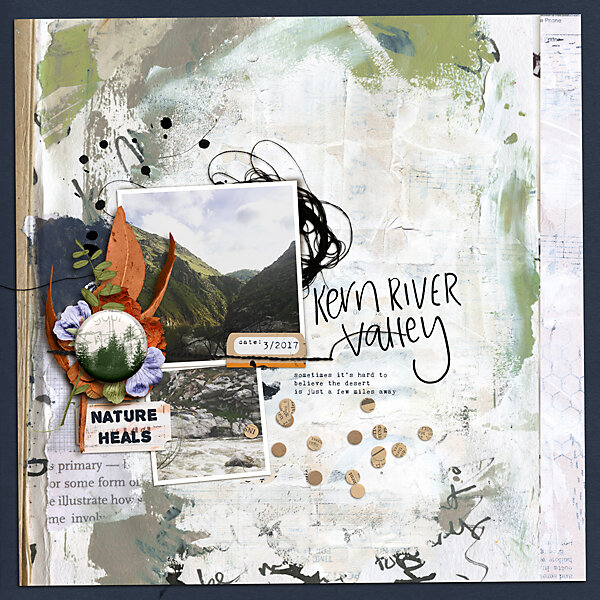
I have some tips and a tutorial for you about using shadows to create depth. In this article I’ll be using Rachels butterflies from her Step By Step Bundle.

Without shadows, these watercolor butterflies blend very well into papers giving us the look of, well, watercolor paints, pencils or crayons.

In #1 above, I used the “multiply” blending mode, then set the “opacity” to 87%.
Because the butterflies are unique elements, we can make them appear to sit on top of the background paper, rather than blended into the paper. This is demonstrated in #2 and #3 by using the layer style “Drop Shadow.”
There are several things to consider when using “Drop Shadow.” These include distance, angle, blend mode and color.
Distance
The distance between elements (or element and paper) is controlled by Distance, Spread, and Size. I typically keep spread at “0” unless I am working with a paper on top of another paper, and my “view” is straight down (as in I’m hovering over the image). If an element is close to the background (#2), “distance” and “size” are smaller numbers. If an element is further away (#3), “distance” and “size” are larger numbers.


Angle
Where is your source of light coming from? Is there more than one source of light? Typically, there is one, strong source of light such as an overhead ceiling light, lamp, or natural light coming from a window or the sun. Take a look at your current environment. Where is the light coming from? Due to that source of light, in what direction are the shadows?
Look at the pictures below of wall art from my current rental property. In both, there is strong natural sunlight coming from the left. Therefore, shadows fall to the right.Look closer at the picture on the right with the blue-green wall. There is a second source of natural light coming from the right. Therefore, there is a second, more faint and “fuzzy” shadow falling to the left. So, in addition to the angle of light, think about the “source” and if the source produces hard distinct shadows, or softer, more diffuse shadows.


When making a layout, I often keep my angle at 90 degrees as if the light is coming from above. However, many put an angle on their shadow. In the pictures below one angle is at 90 degrees while the other is at 109 degrees.

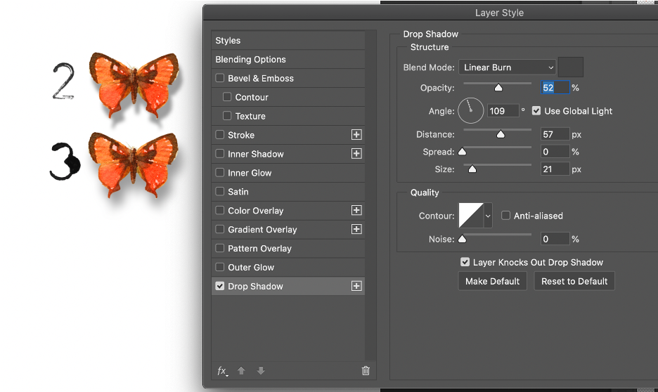
Take note of the “Use Global Light” check box. In the majority of my layouts, I use this feature to keep consistency throughout the layout. However, there are times I make a layout using two (or more) sources of light. In that scenario, I unclick the “Use Global Light” feature.
Blend Mode
I am a fan of Linear Burn blend modes and use that blend mode more than others for shadows. However, if a background paper is exceptionally dark, e.g. black, I may use the Multiply bend mode to produce a softer shadow. In the picture below, the butterfly on the left has a Linear Burn shadow while the butterfly on the right has a Multiply shadow. That’s the only difference between the two!
Also, take note of “opacity” located directly below the Blend Mode drop down. Low (or decreased) opacity creates softer shadows, as if the light is diffused or the element is further away from the background or source of light. High (or increased) opacity creates darker shadows, as if the light is very bright or harsh or the object is very close to the background.

Color
You can change the color of your shadows. I typically use a dark, charcoal grey. However, there are times when I want a “warmer” shadow and go for a dark, rich brown or “cooler” shadow and go for a blue—black. I seldom use pure black as the color of the shadow is too dark and looks unnatural (unless the light is super strong or I’m going for a gritty, super contrasty look). Also, if I’m working with a dark or black background, I may opt for light grey to give myself greater wiggle-room with opacity.
Advance technique: Make the shadow its own layer!
1. With your arrow directly over the shadow effect, right click, then choose “create layer.” This will create a new layer that is the drop shadow.

Notice in the picture below, there is a new layer that is the drop shadow.

2. With this new “drop shadow” layer, you can now manipulate it however your heart desires. A technique I use often is “transform,” which is command T on my platform. With the transform tool enacted, I often use “warp” to alter the shape of the shadow.
Before (with warp tool enacted):

After: Look at the subtle differences between the three butterflies’ shadows. In the third (or far right) butterfly, I used two different drop shows using the techniques described in the tutorial above.
One shadow is set at Distance: 67, Spread: 0, Size: 57
The second shadow is set at Distance: 16, Spread: 0, Size: 21
On the first shadow, I used the warp tool as describe above. On the second shadow I created a mask, then “erased” away portions that created discord. Discord—when you create shadows on separate layers, then run filters or blending modes on those layers, there may be additive affects that produce VERY dark, unnatural shadows. To correct this, I use a layer mask to erase away portions of the undesired shadow. You can see that mask in the picture.

It is a lot more work to create shadow layers then mask them. However, these added steps and attention to detail bring our digital scrapbooking layouts to life! We go from flat, and two-dimensional, to 3D!
Next month I will have a new tutorial on adding a gradient mask to an element to create the illusion of added depth. Until then, visit the Rachel Jefferies Mixed Media Challenge for September 2020 for some additional inspiration and a few more notes on shadows. I hope to see you there!
If you have any questions or a-ha moments please leave us a comment!